The Challenge
AlphaCore serves the most demanding audience in wealth management. Post-liquidity founders sitting on $20M to $250M+. UHNW families running their own offices. Institutional-minded entrepreneurs who already know what good investing looks like and choose advisors on rigor.
The product was already strong. AlphaCore's research and portfolio construction were holding their own against every name in the category. The brand and growth infrastructure underneath wasn't keeping pace with what the firm was becoming. As the AUM grew and the client roster moved further up-market, the question stopped being "do they trust the team" and became "does the brand match the level of seriousness the firm already commands."
The Strategy
We've been the strategic partner since the start. The frame: AlphaCore is data at scale, read with precision.
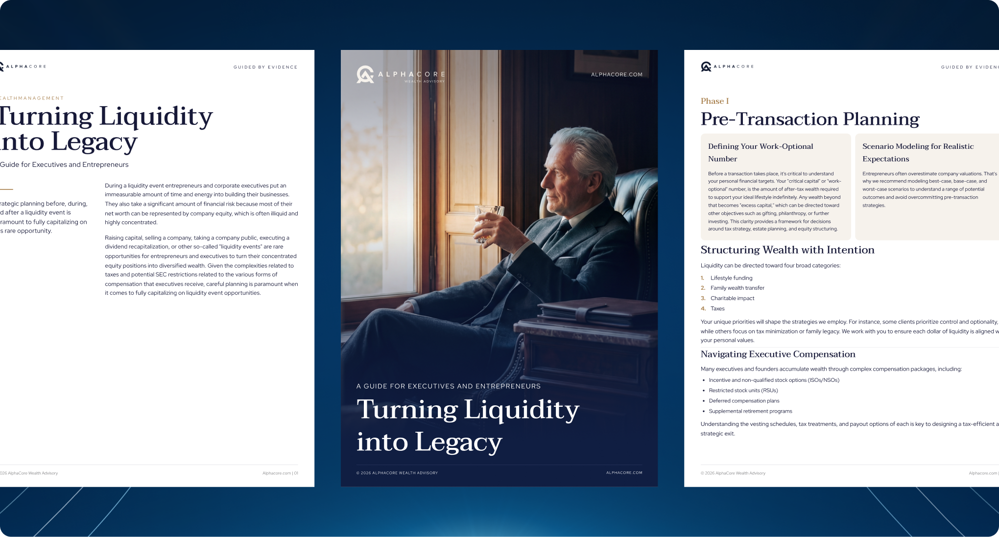
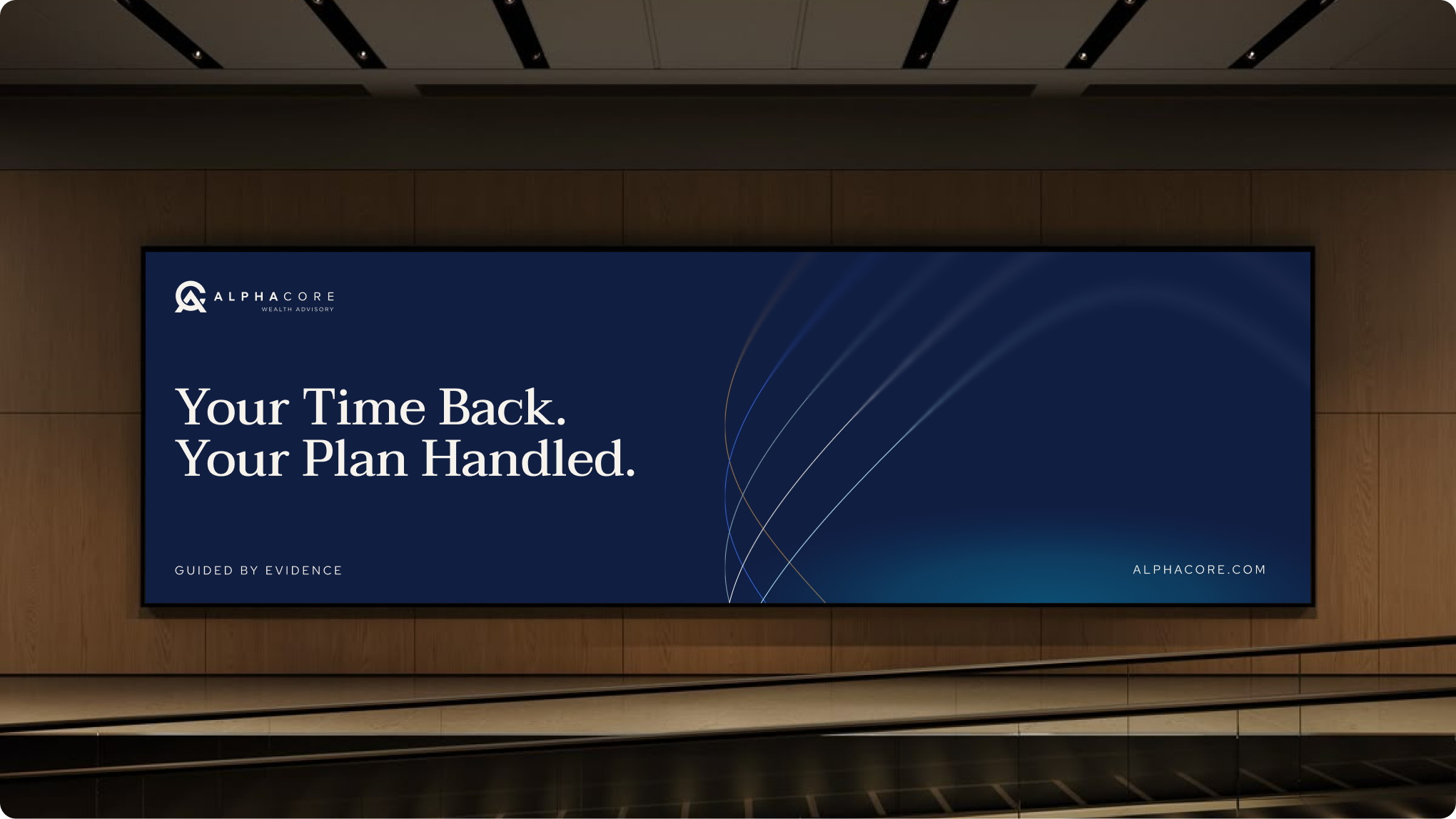
The old positioning, "Uncover your Alpha," was the same promise every wealth manager was making. The new positioning, "Guided by Evidence," moved the firm out of the performance-promise category and into the process-integrity one. Different category. Different conversation. Different kind of client.
That principle reshaped every downstream decision. The ICP locked as the Institutional-Minded Entrepreneur. The architecture committed to a Branded House with four endorsed service lines. The visual identity rebuilt to look like what AlphaCore actually is: an evidence-based research practice that manages money, not a wealth firm running on returns alone.
The Identity System
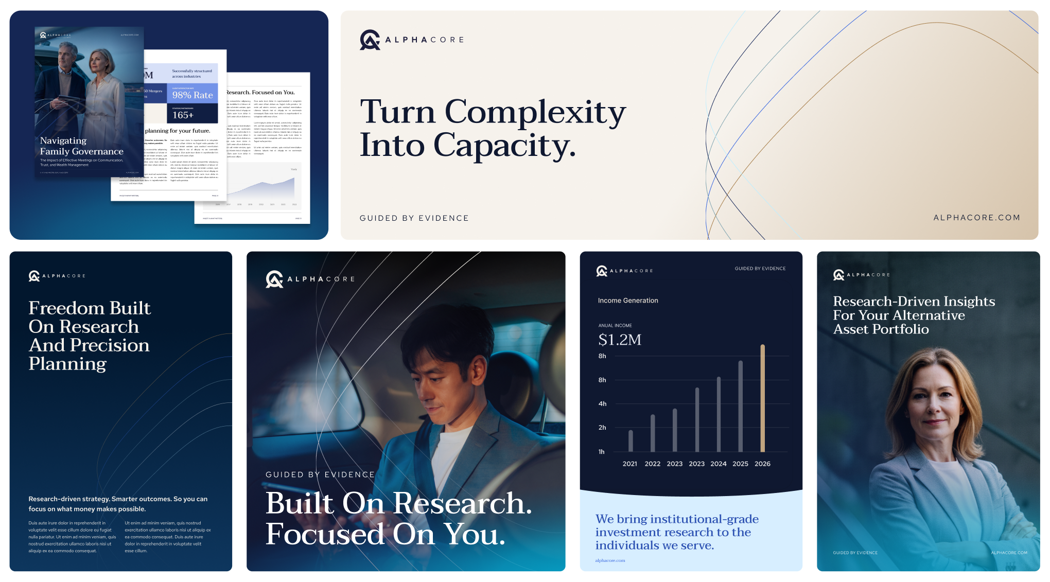
The visual system treats evidence as the hero. Navy and bronze. Red Hat Display.
A two-tone logo with rules tight enough that the brand can't drift across the team, the partners, the events teams, the marketing partners. The Research Page reads like a research firm wrote it. The Brand Kit and fuller Brand Guidelines became the source of truth so every group at AlphaCore works from the same foundation.
Premium, calm, restrained. No luxury clichés. No yachts. No planes. No golf.
Applications
A new website built section by section, every page audited against a 700-pixel fold rule.
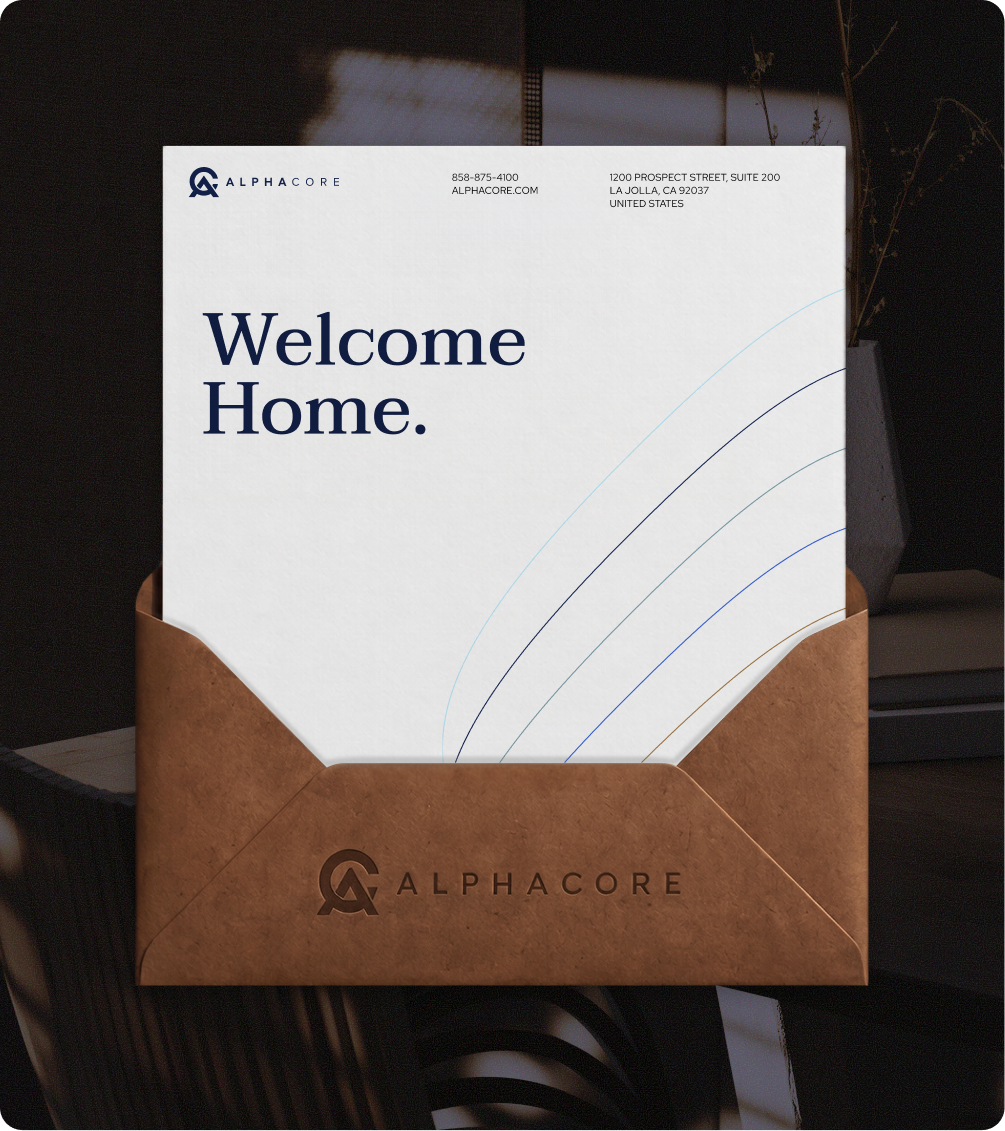
Decks that look like AlphaCore from slide one. Stationery printed and shipped, including foil treatments on accent swooshes and the wordmark. Event signage for client gatherings, including the Wealth Summit at Conrad San Diego. A Bethesda Big Train booth program. Office signage across the SPC building. Partner-facing materials, marketing collateral, and the print pieces that hold up at arm's length.
The Result
AlphaCore is one of the fastest-growing wealth management firms in America. Four firms acquired this year alone.
One consolidated brand carrying the weight, with touchpoints expanding across web, print, events, and partner-facing materials.