The Challenge
Seagulls had spent twenty-nine years building one of the most established media networks in Jordan. Across digital out of home, traditional out of home, retail advertising, and broadcast, they had inventory and relationships most regional players couldn't touch.
Two things were happening at once. The 29th anniversary was approaching, which meant the brand had earned a moment of reflection. And a new generation of leadership was taking the network into its next decade. The brand also carried a perception problem the leadership wanted to solve. Local small businesses saw Seagulls as untouchable. Premium meant unapproachable.
The brief came down to a single tension. Seagulls had earned the right to look like a regional authority. The next generation needed it to also feel like a brand a small business owner could pick up the phone and call.
The Strategy
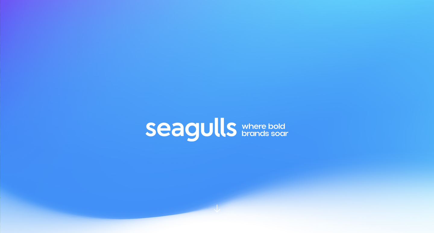
We anchored the work to a single move. The next chapter of Seagulls would be bold but approachable. Authority that listens. A network that talks to a regional advertiser the same way it talks to a global one.
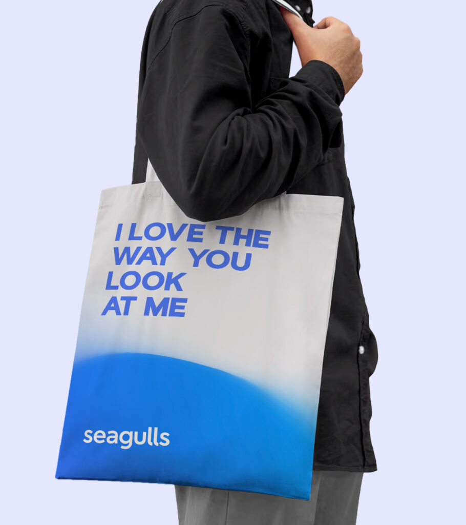
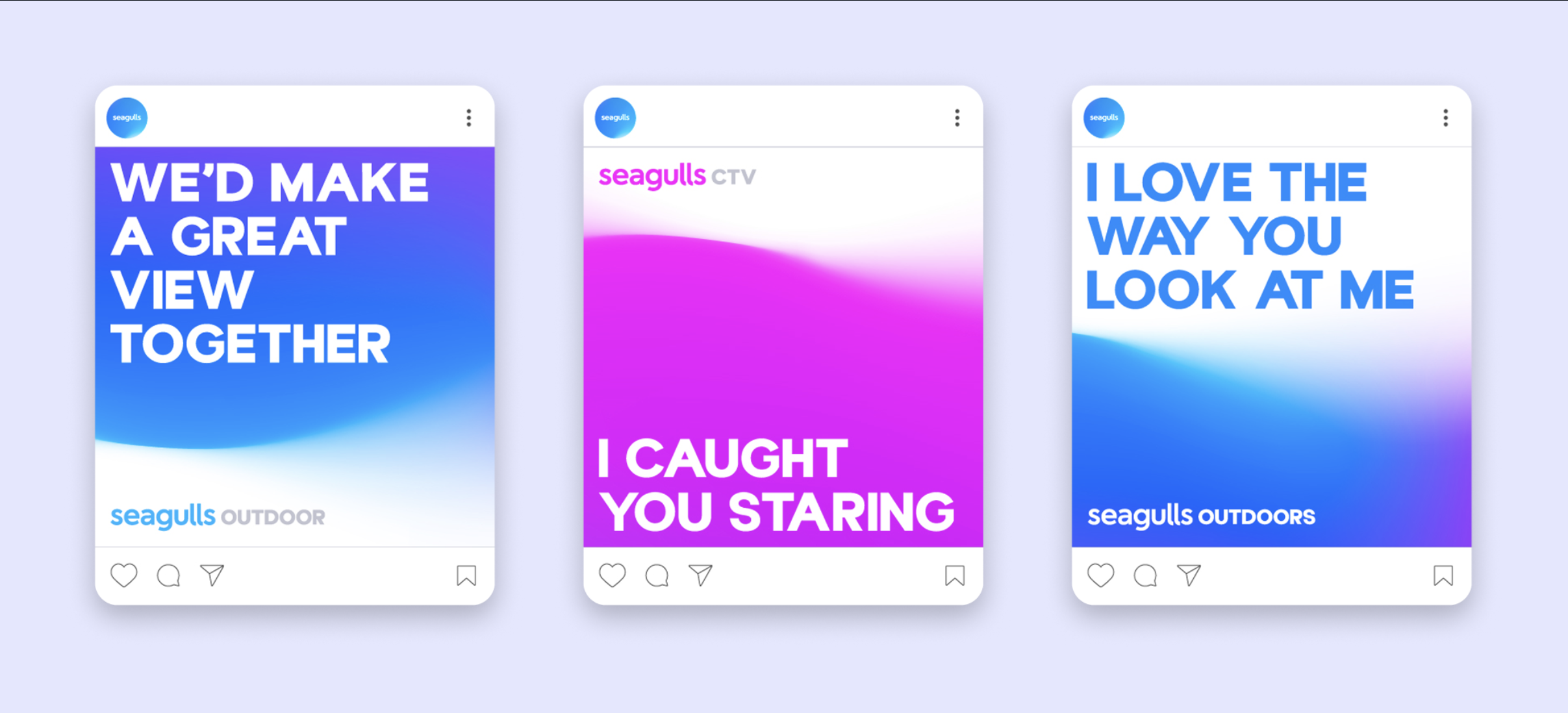
The campaign line landed it. "I love the way you look at me." A line that's confident enough for a category leader and warm enough that small businesses see themselves on the receiving end of it. The new generation got a brand that carries the network's history forward without being trapped in it.
The Identity System
The new brand reads as a tech-led media company. Programmatic isn't a feature. It's the operating principle.
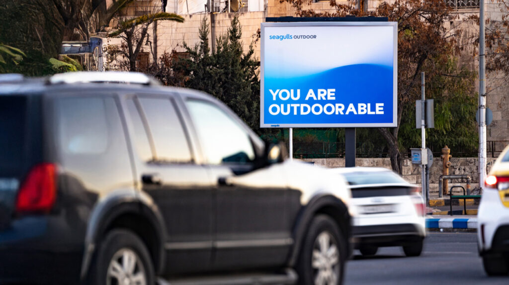
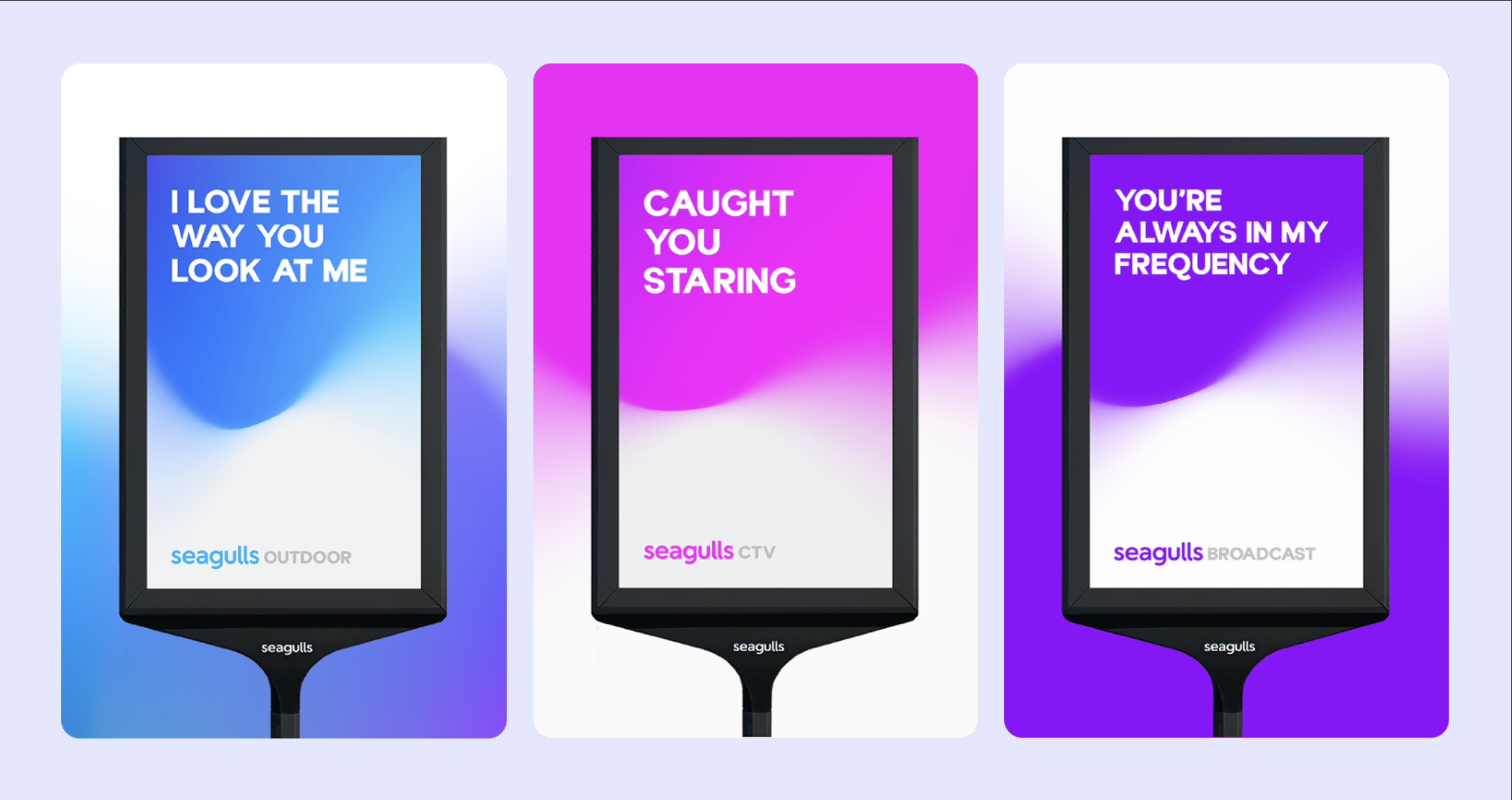
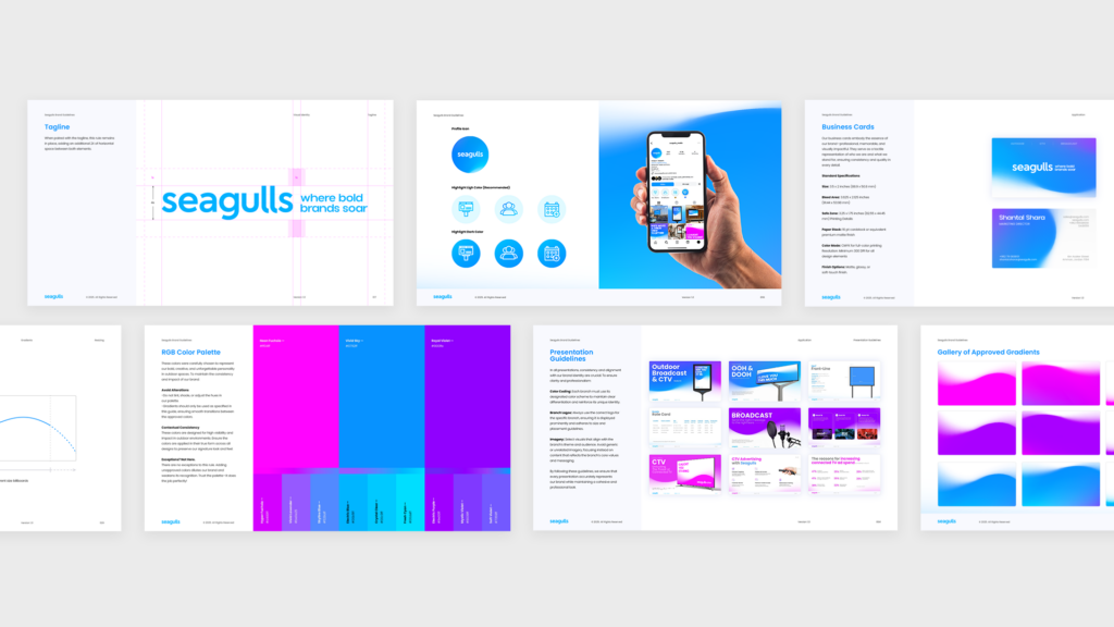
The site organizes the entire offer around three product lines, Outdoor, Broadcast, and CTV, each with a distinct color identity inside one cohesive system. Outdoor leads with a deep blue. Broadcast moves to violet. CTV closes with magenta. The gradient logic ties the network together visually while making each product line ownable on its own.
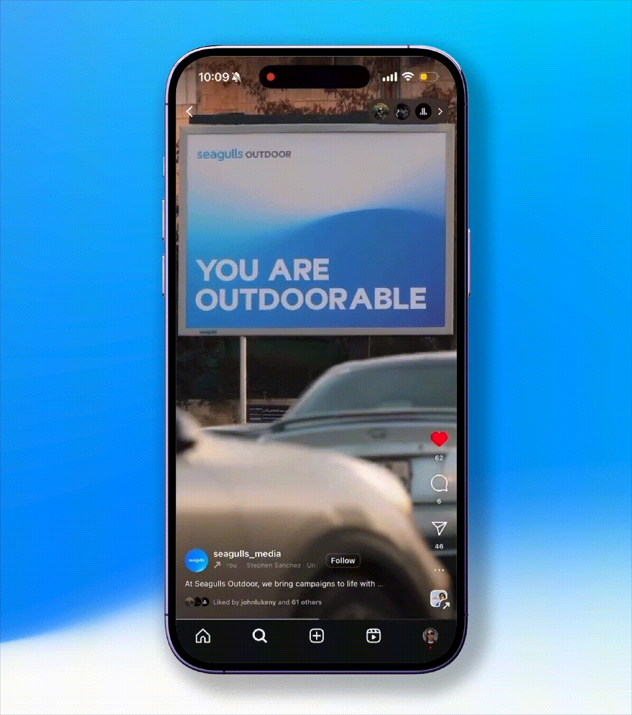
The wordmark is set in lowercase, which softens a category that defaults to all-caps shouting. The visual system uses screen-shaped frames as a consistent device, a nod to the medium itself. Motion is built in from the start because a DOOH brand whose product is screens cannot live in stills.
Applications
Site. Rebuilt around the product taxonomy. Outdoor, Broadcast, CTV each get their own page, their own color, their own product story, with shared navigation and a single Schedule a Demo destination.
Inventory presentation. A new "Our Inventory" module makes the network feel tangible. 1,000+ premium ad spaces. 69,000+ campaigns. 29 years in industry. 1M+ cumulative listeners.
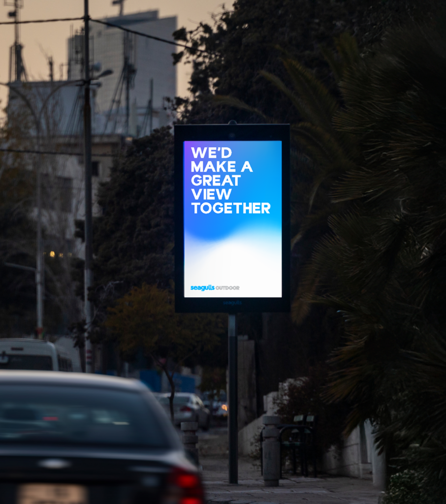
Brand campaign. The "I love the way you look at me" line ran across owned media, with full-bleed billboard mockups that demonstrated the product and the voice in the same frame.
Local credibility. A "Companies We Work With" section anchored the site around regional logos like Mövenpick, Kia, Manaseer, and Arab Bank.
The Result
37% quarter over quarter growth in web traffic. 27% employee growth in the year following the rebrand. 250+ press mentions.
The brand reframe gave Seagulls room to grow into the next decade of programmatic out of home without abandoning the network they spent twenty-nine years building.