The Challenge
The American Cancer Society is the leading force against cancer. The organization supports every journey from research and advocacy through patient care, with the goal of ending cancer for all. The recognition the brand has earned across decades is its most valuable asset and, increasingly, its most fragile one.
The fragility was showing up in the numbers. Donations were declining. Relevance was eroding among younger and multicultural audiences. The "fight cancer" message that had powered the organization for decades was reading as institutional, distant, and culturally narrow to the demographics ACS now had to mobilize. The mission was as urgent as it had ever been. The brand wasn't translating that urgency to the people whose support the work depends on. ACS faced the rebrand every legacy nonprofit eventually faces, where the question is how to evolve without erasing what made the organization recognizable in the first place.
The Strategy
In partnership with Havas, we anchored the rebrand to a single shift. ACS would stop telling stories about what the organization does, and start telling stories about the impact it makes and the community it serves.
That shift is more than a messaging update. It moves the brand from institutional posture to community posture. From "we fight cancer" to "we are the community that fights cancer with you." Every downstream decision flows from there. The visual system, the photography, the vision statement update, and the brand guidelines that now run across all ACS surfaces in the United States all serve that single repositioning.
The Identity System
The system had to do two things at once. Honor the brand recognition ACS has earned over decades, and make room for an audience the original brand wasn't designed to reach.
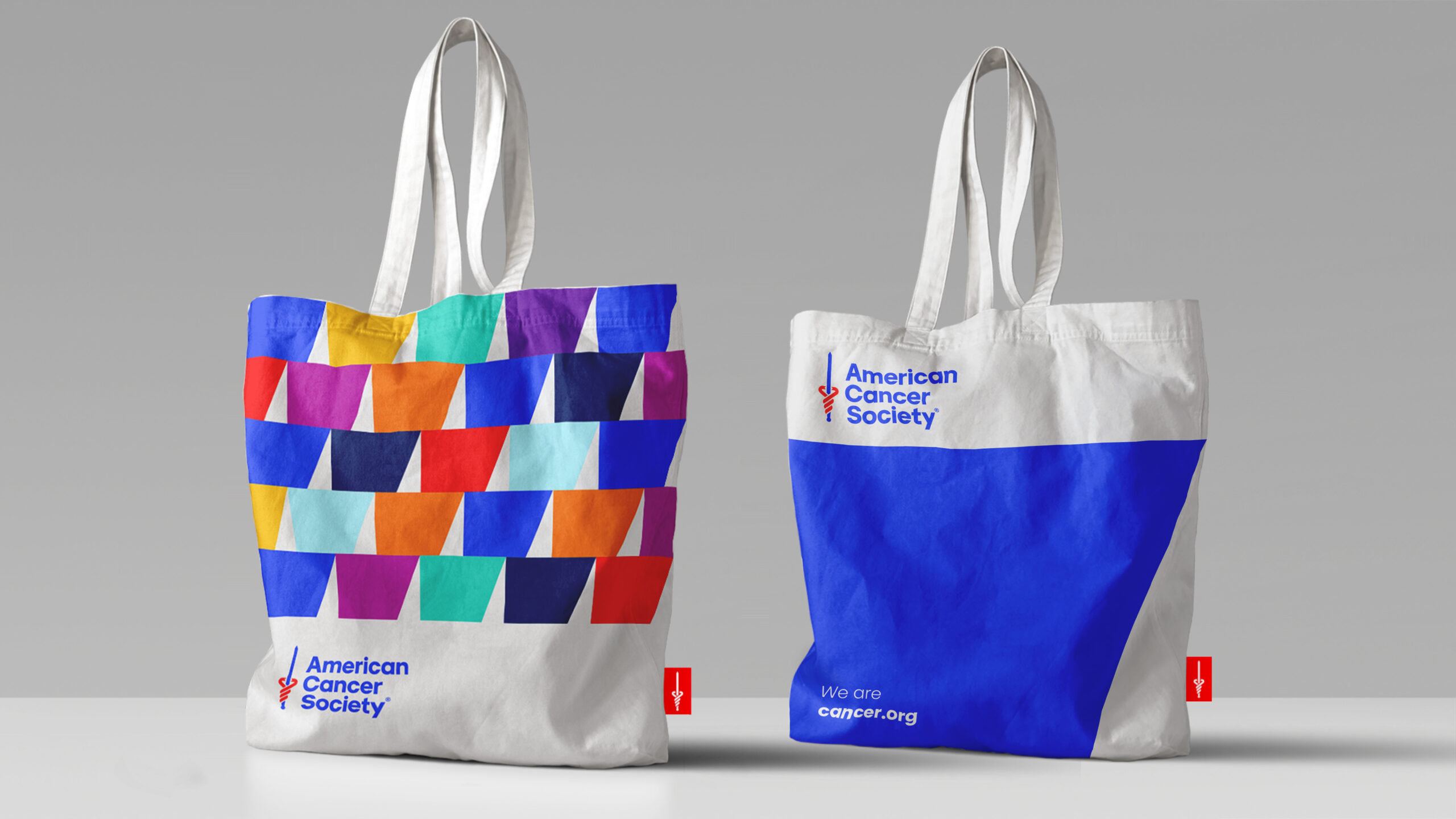
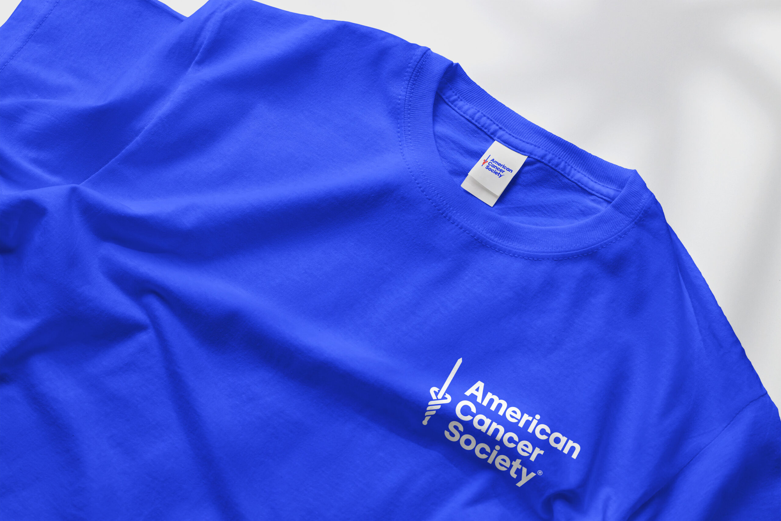
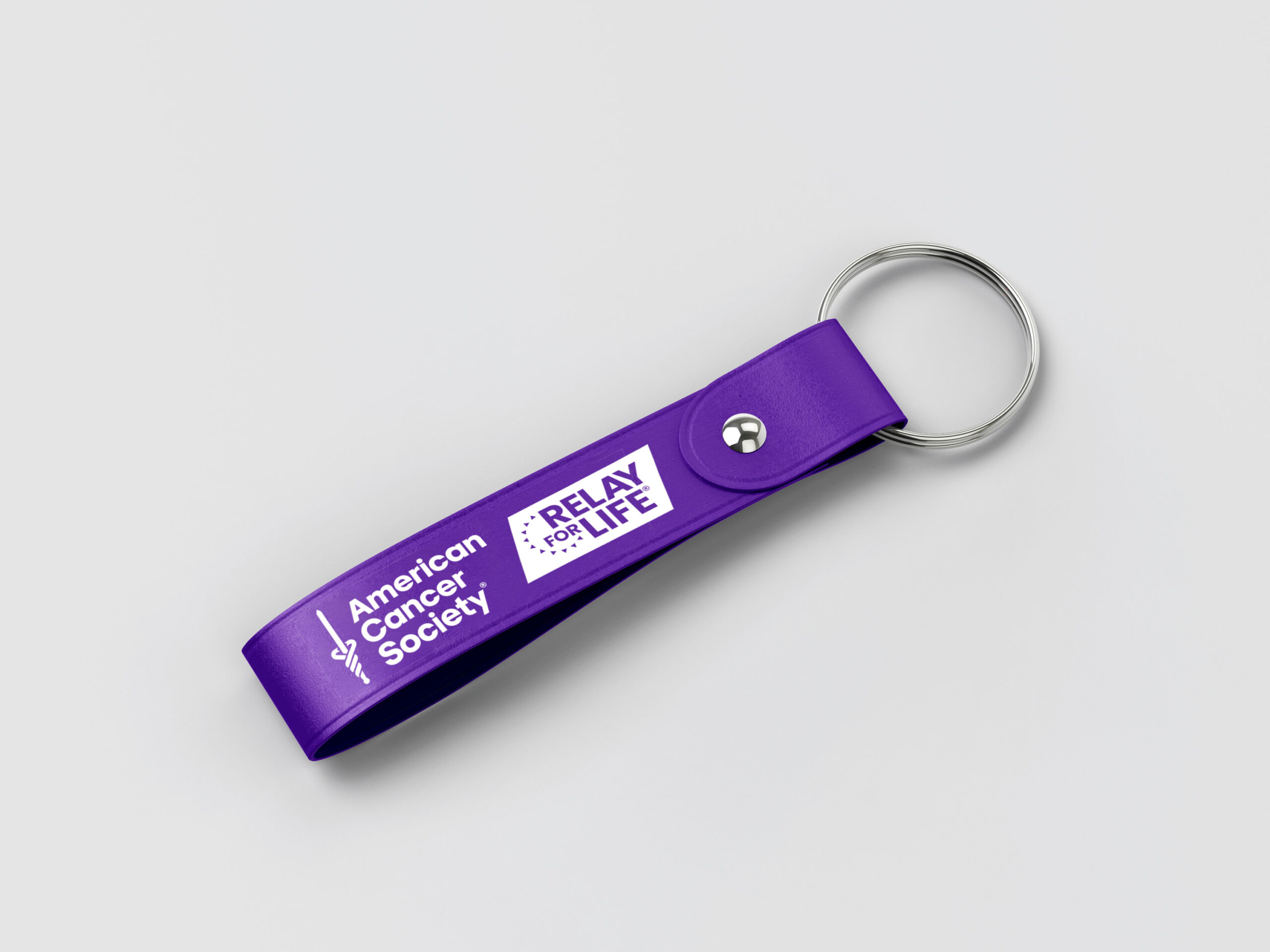
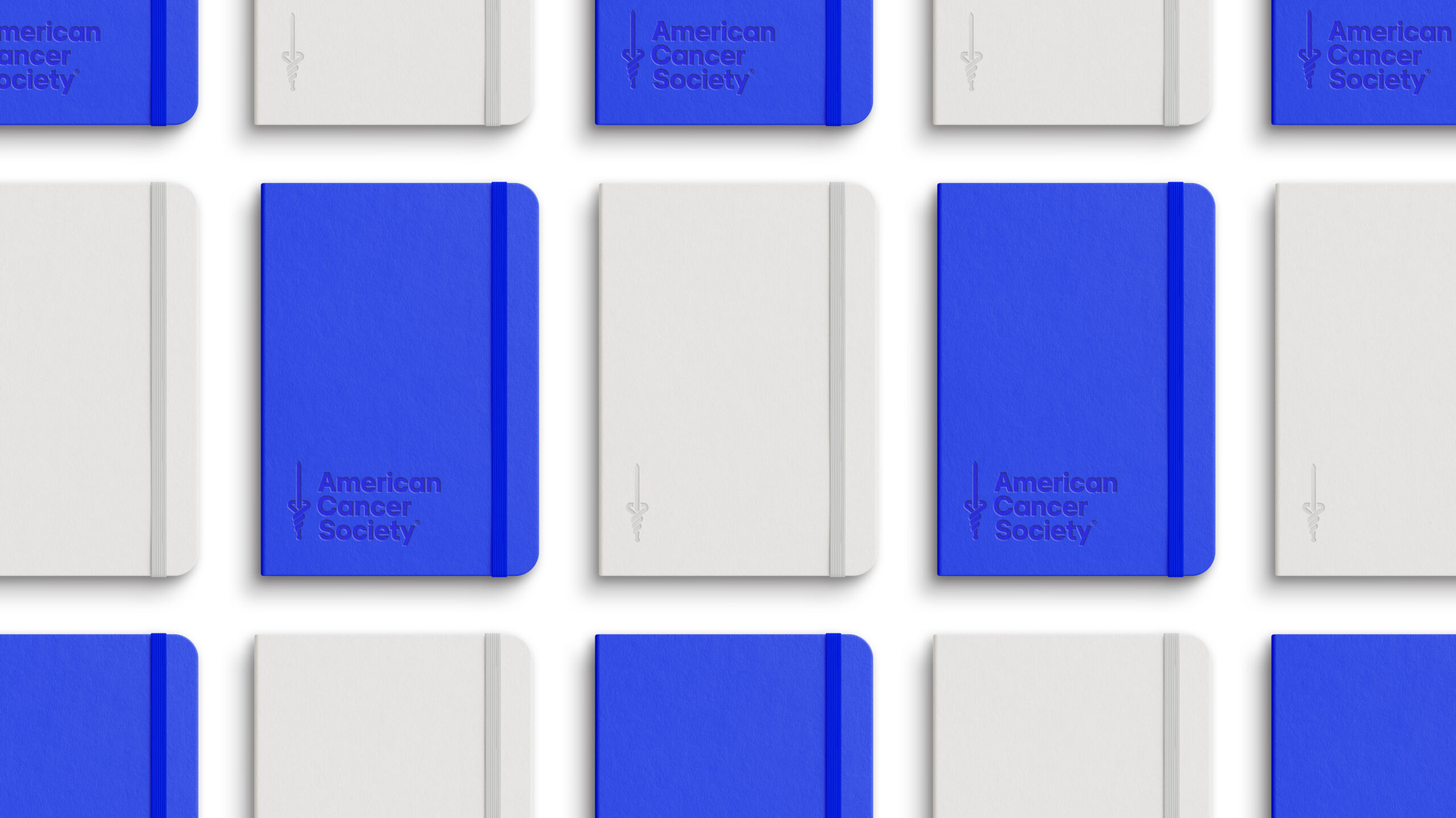
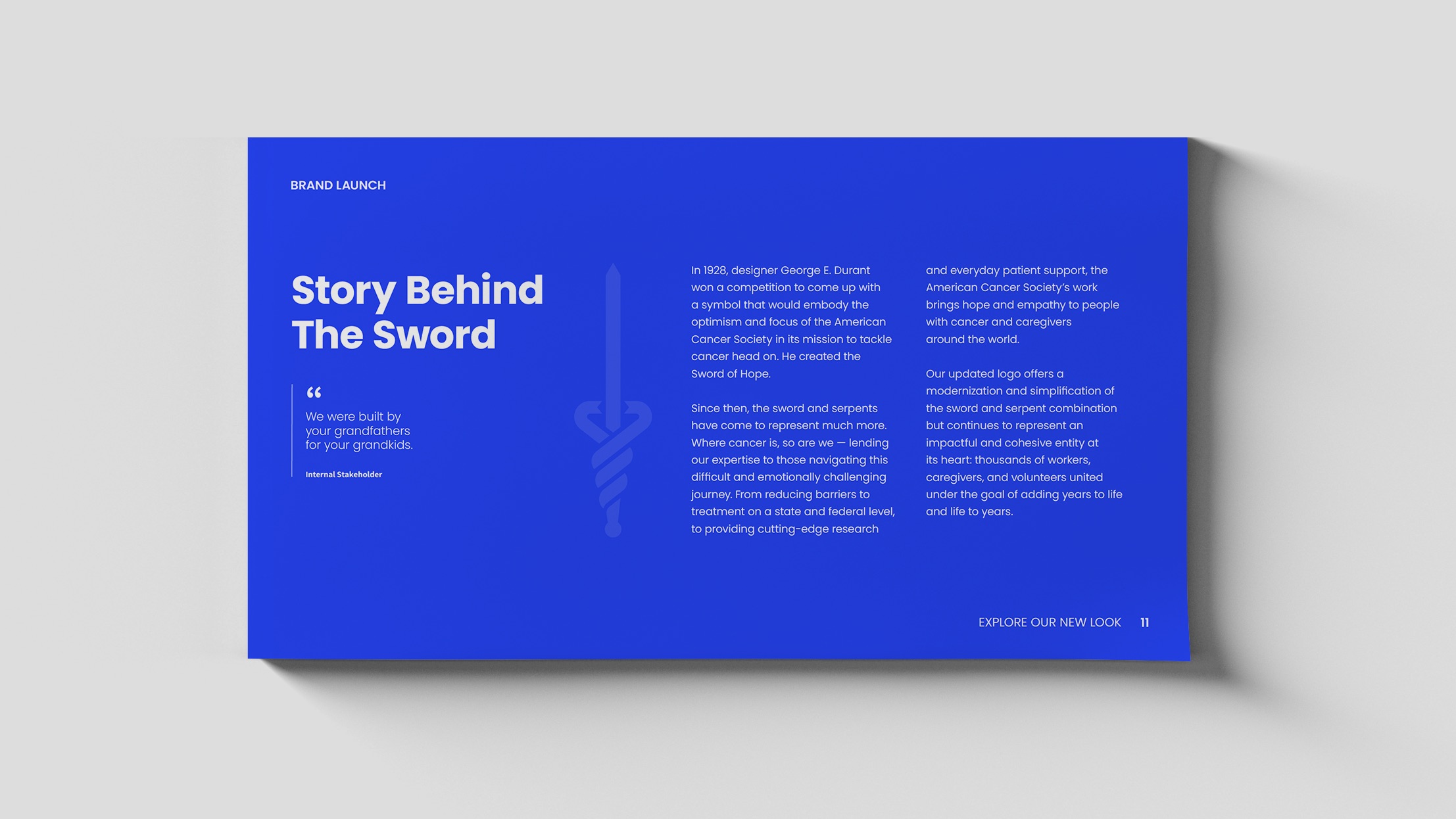
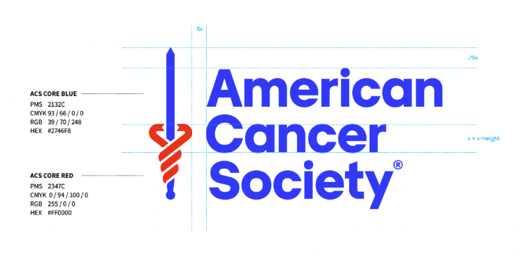
The Sword of Hope, ACS's most recognizable visual asset, was modernized rather than replaced. The mark stays unmistakable while reading as contemporary. Heritage preserved, weight reduced. The decision to keep the symbol and refine it instead of starting over was itself the positioning. ACS isn't a new organization. It's the same organization meeting a new generation.
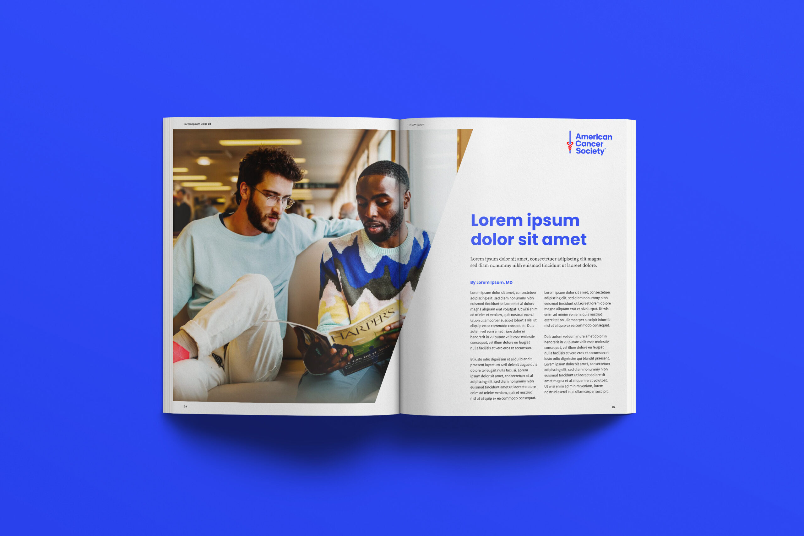
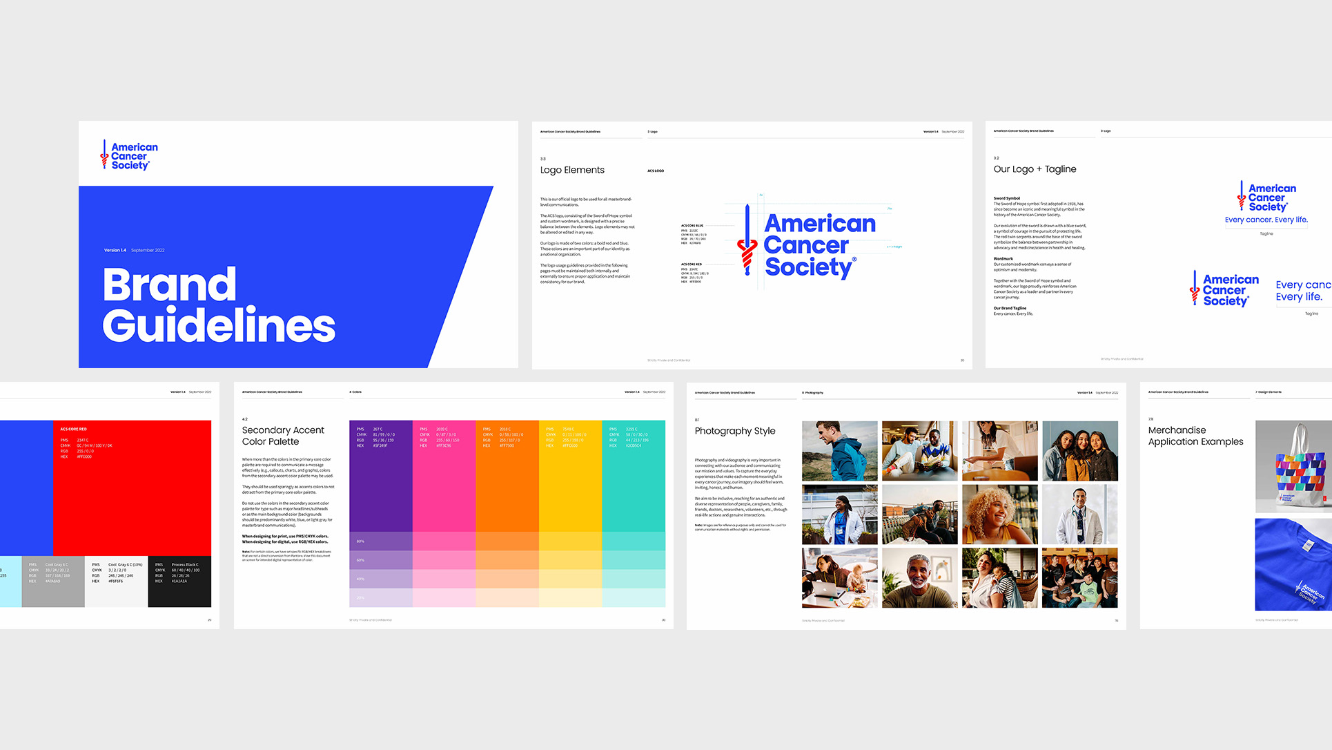
The color palette was lifted from clinical gravity into a register that signals life and momentum. The shift moves the brand away from the visual language of cancer-as-illness and into the visual language of cancer-as-community-fight. Photography was rebuilt around life and hope. Sunlit, organic images of people and communities replaced the clinical and the distant. Together the visual decisions lift ACS into a register that meets younger and multicultural audiences where they actually live.
The vision statement was updated to read "To end cancer as we know it, for everyone." The line signals inclusivity and aligns ACS with the national cancer initiatives the organization works alongside. It also gives the organization a public-facing thesis that every campaign, chapter, and partnership can map back to.
Applications
Comprehensive brand guidelines. A full brand system that ACS now uses across the United States, from local chapters to national campaigns.
Website and online presence. The brand carries across the digital surface where most donors first encounter the organization.
Fundraising campaigns. Personalized engagement strategies built on the revitalized brand presence.
Community outreach. Local chapter materials brought into the national brand system.
Research initiatives, media presence, and advocacy. The brand carries into the channels where ACS's policy and research work lives.
The Result
34% increase in funds raised, attributed to personalized engagement strategies and the revitalized brand presence.
The vision statement update aligned ACS with national cancer initiatives and reframed the organization's work for the audiences it now needs to reach.