The Challenge
AzureCell came to us as Azure Cell Therapies. A descriptive working name that read as a category placeholder, not a brand. No positioning, no identity, no narrative system, just the science and a team preparing to enter every consequential conversation a science-led company has. Investor pitches. Partner introductions. Talent recruitment. Customer trials. Each one would happen against companies that had years of brand equity and trust to draw on. AzureCell would walk into each room with nothing but the work and whoever had the meeting on their calendar.
The brief was the most ambitious version of a brand engagement. Build everything from the ground up, fast enough to compete and substantial enough to last. Not a placeholder identity to be replaced after a Series A. The real foundation, designed to scale with the company through every stage that follows.
The Strategy
We anchored the work to a single line.
The line does several jobs at once. Engineering signals the rigor of a science-led company that can't afford to read as soft on technical execution. Hope signals the emotional weight of what the company is building toward, which is why investors fund the work and talent joins it. Together the two words give the team a sentence every conversation can map back to, from the technical pitch to the fundraising pitch to the talent pitch.
The brand had to read as a serious engineering company on first contact, with the emotional resonance the mission earns later. That sequence matters. Lead with credibility. Earn the right to be moving. Hope is the reward for rigor, not a substitute for it.
The Identity System
The naming process ran through hundreds of candidates before landing on AzureCell. The final name compresses what Azure Cell Therapies spelled out, keeping the science legible, clears legal across markets, owns the digital footprint, and works in every conversation the company will have for the next decade. The shortening is the positioning. A descriptive name says what the company does. A real brand name says who the company is.
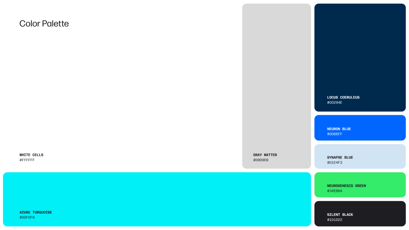
The visual identity is built to read as confident and engineered. Typography, color, and the supporting system signal precision before they signal anything else. The system was deliberately built to look like the kind of company that earns institutional credibility, because AzureCell had to look like that company before it became one.
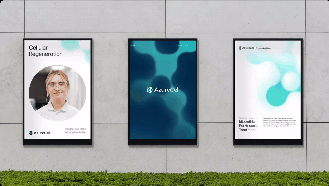
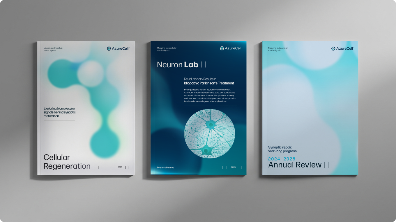
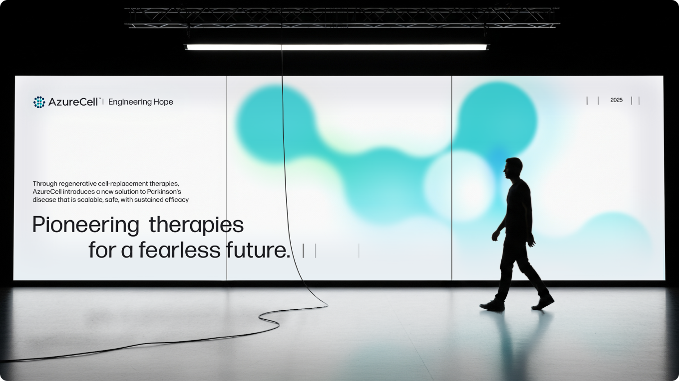
Key brand graphics extend the visual language into the technical materials AzureCell needs. The brand reveal video introduces the system to investors and partners, treating the brand launch as a moment rather than a soft rollout.
Applications
Naming. A name that holds across markets, audiences, and the technical conversation.
Brand positioning and tagline. Engineering Hope as the anchor for every conversation.
Visual identity. Logo, color, type, and the supporting system.
Website. The first marketing surface investors and partners encounter.
Pitch deck. Built to match the brand and the seriousness of the science.
Key brand graphics. Visual assets extending the system into technical materials.
Brand reveal video. The motion piece that introduces AzureCell to the world.