The Challenge
Blue Ocean Software arrived at the moment growing companies usually arrive at after an acquisition. The combined firm had real talent and a real track record. It had clients in fleet management, oil and gas, and consumer products. What it didn't have was a brand that matched what the company had become.
Two things were happening at once. The acquisition had brought new capabilities and a new generation of leadership into the firm. And the visual identity the company had been operating under no longer matched the work or the leadership behind it. Clients in fleet, energy, and CPG don't tolerate ambiguity. The brand needed to read as steady as the systems Blue Ocean builds, and as sharp as the leaders now running the firm.
The Strategy
We anchored the work to a single principle. Blue Ocean simplifies the complex without dumbing it down. The brand had to read as the kind of partner an operations team in a high-pressure industry actually wants on the project. Confident, technical, and clear.
That principle drove every downstream decision. Color, type, motion, voice all map back to it. The post-acquisition brand had to do something most M&A rebrands fail at, which is feel like one company on first contact rather than two stitched together.
The Identity System
The new logomark is a dynamic, spherical waveform that captures momentum, depth, and precision. The mark was built to hold space in any room it enters and was registered as Blue Ocean to protect it. The wordmark is clean and modern, paired with the symbol to give the brand a system, not just a logo.
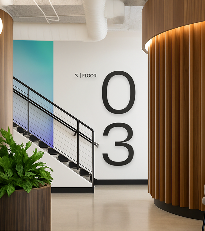
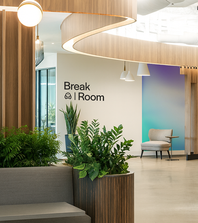
The color system moves well beyond a single brand blue. A gradient-led palette spans teal, purple, warm amber, and green. Each tone serves a distinct industry vertical that Blue Ocean works in, while remaining unmistakably Blue Ocean across the system.
Applications
Site. Built around the brand system, with vertical-specific entry points for fleet, energy, and consumer products.
UI components. Blue Ocean's product interfaces carry the new visual language.
Environmental. Wayfinding and environmental design across Blue Ocean's physical offices.
Motion graphics and pitch deck. The deck was rebuilt to match the ambition of the pitch inside it, with motion graphics that bring the gradient system to life.