The Challenge
CMOspot operates in the part of the market where serious marketing leaders evaluate platforms, partners, and peers. The audience is unforgiving. Marketers see brand work for a living. The company also had a raise on the horizon, which meant the brand had to do two jobs at once. Earn the attention of senior marketing leaders who would use the platform, and earn the confidence of investors who would fund it.
The challenge was to build a brand that could enter both rooms. A brand that read as a peer to the marketing leaders the platform serves, not a vendor to them. And a brand that justified the price the platform needed to command from day one.
The Strategy
We anchored the work to one move. CMOspot's brand should look like it was built by people who have sat in a CMO's chair, not for them. Confidence over volume. Restraint over decoration. Every signal in the brand should land for an audience that reads brand cues professionally, whether that audience is a senior marketer evaluating the platform or an investor reading a deck.
The Identity System
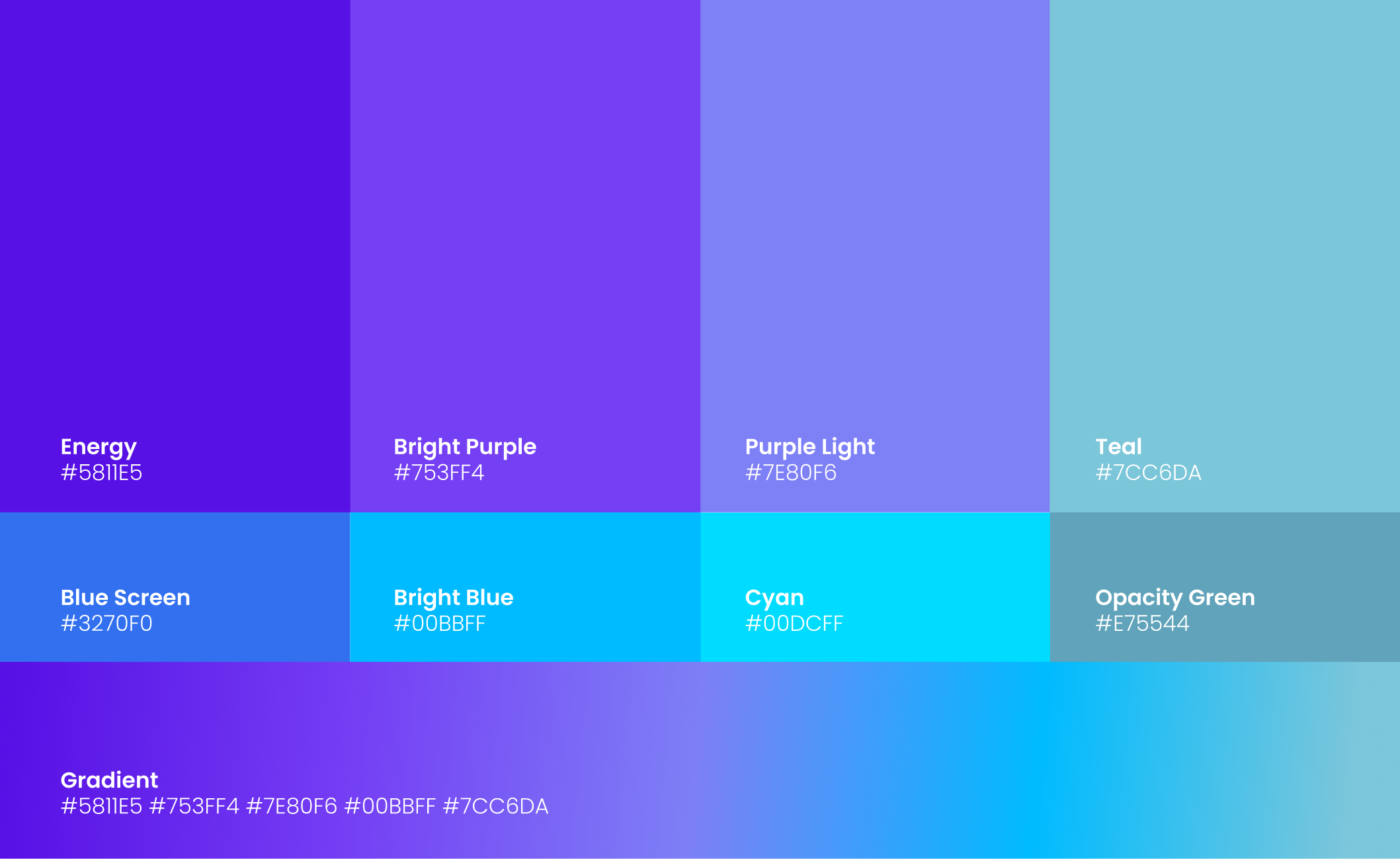
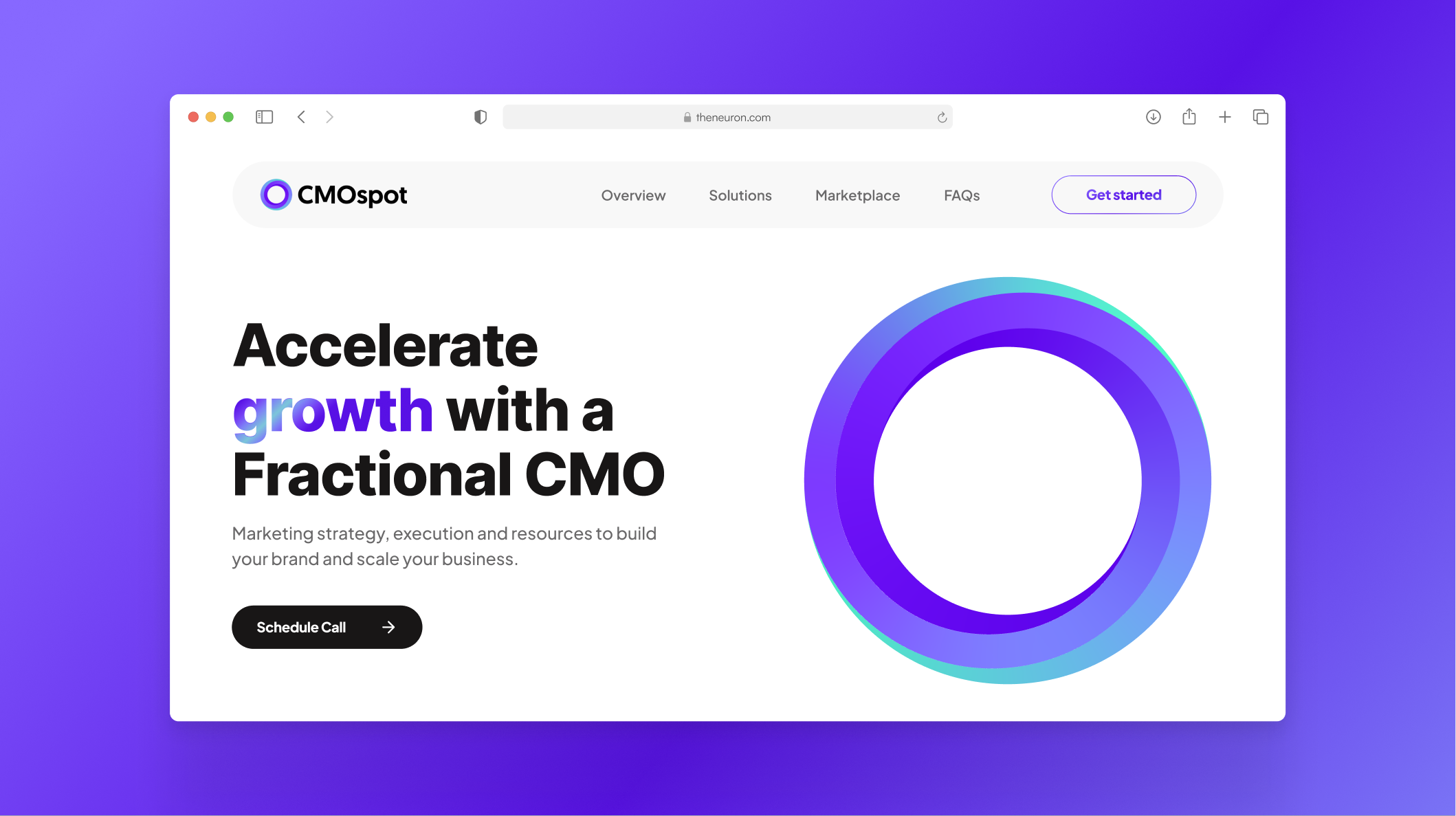
The visual identity is built around a confident, restrained system. The wordmark carries authority without overworking it. Color is precise, not loud. Typography is set up for the long-form thought leadership and platform UI the brand has to support equally.
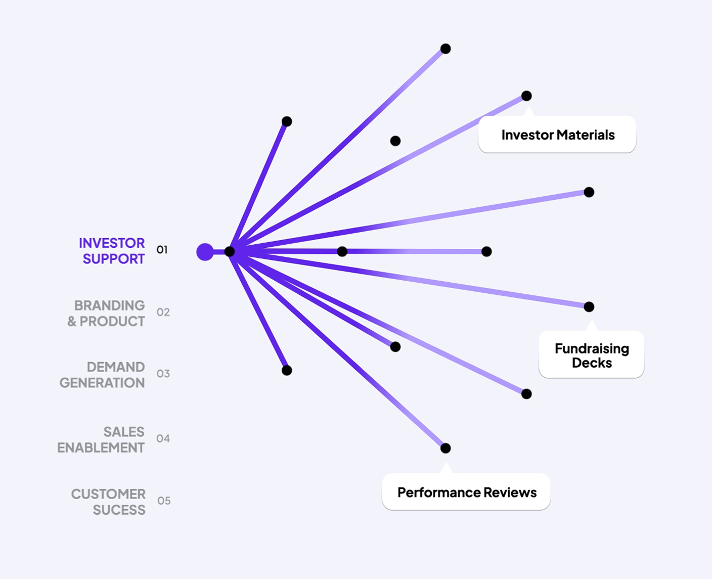
The supporting graphic language treats the audience as the hero. Marketing leaders aren't featured as logos on a partner wall, they're treated as the protagonists of the platform's content.