The Challenge
Divide is a video FX company that specializes in high-end content creation. The category lives or dies on craft, and the brand had to read at the level of the work the studio produces. Buyers in this market are sophisticated, the conversations are short, and the brand has to do credibility quickly.
The Strategy
We anchored the work to one principle. The brand should signal the level of craft the studio brings to every project. Restraint, confidence, and a system that lets the work itself be the hero of every surface.
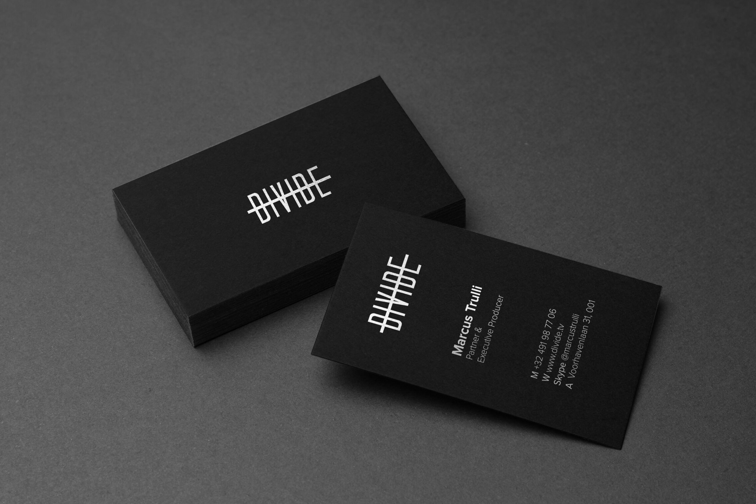
The Work
The visual identity is built to give Divide's work the room it needs. Typography is set up to support the imagery, not compete with it. Color is restrained. The system is designed to hold across the marketing site, the reel, and the partner-facing materials Divide uses to win projects.