The Challenge
Knack Cannabis came to us with a position the New York market was waiting for. The first recreationally grown cannabis brand in the state, cultivated in the Adirondacks, with bold flavors and local pride at the center of the story. The category in New York is crowded with brands that look and sound similar to brands in every other legal state. Knack needed to feel like it belonged to New York, not to the category.
Cannabis is also a heavy M&A category. Brands get acquired, licensed, and consolidated as the market matures. The brand had to do its job on the shelf today, and hold its value as an asset tomorrow. That meant it had to be strong enough to win retail competition, and disciplined enough to read as a real asset to a future buyer.
The Strategy
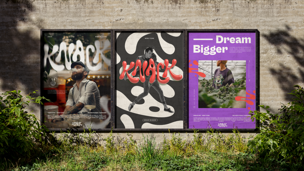
We anchored the work to one principle. Knack is a New York brand first and a cannabis brand second. The visual and verbal identity had to lean into local pride, the Adirondacks origin story, and the lifestyle posture the New York market actually responds to.
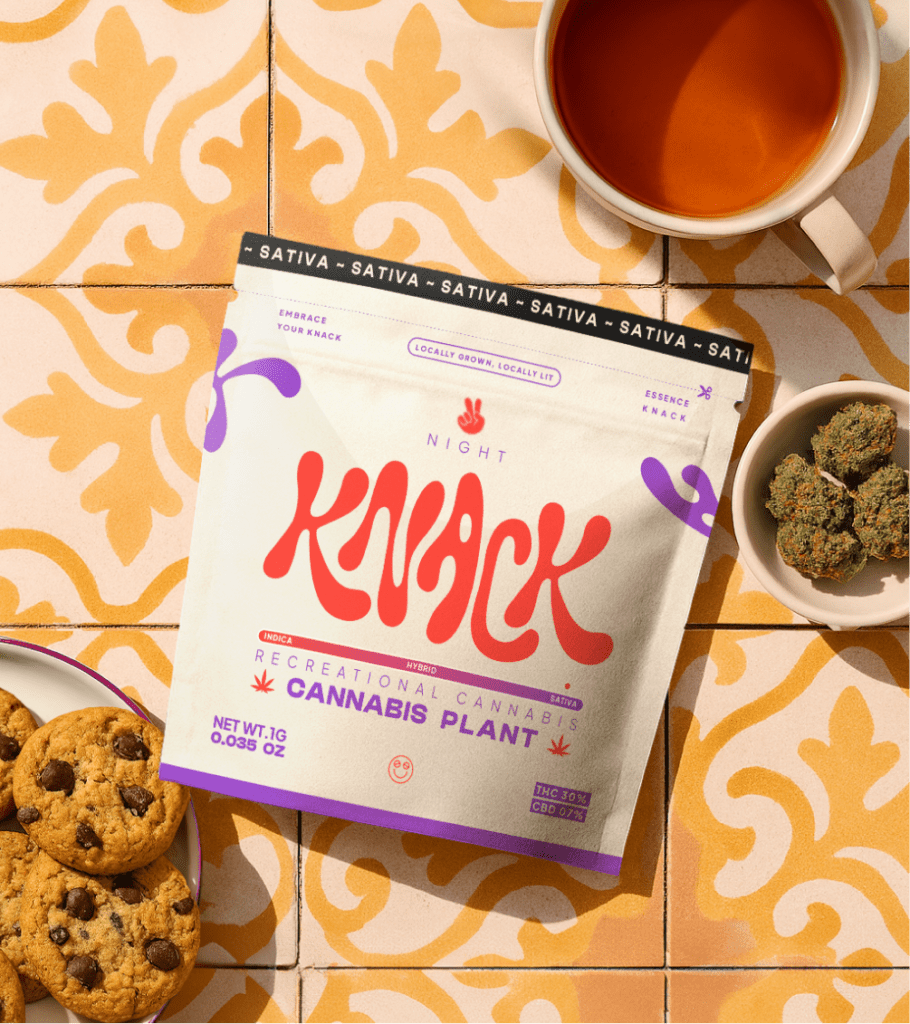
The brand needed to read as a product someone wants to be seen with, not a product someone hides. That distinction shaped every downstream decision, and it carried a second benefit. A brand that wins on the lifestyle dimension also reads as a real asset, which matters when the category consolidates.
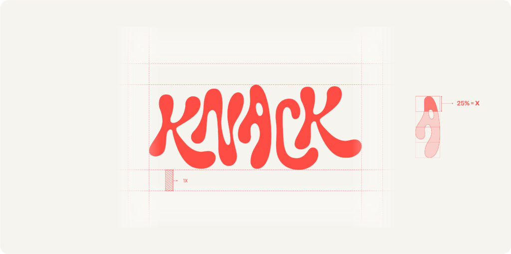
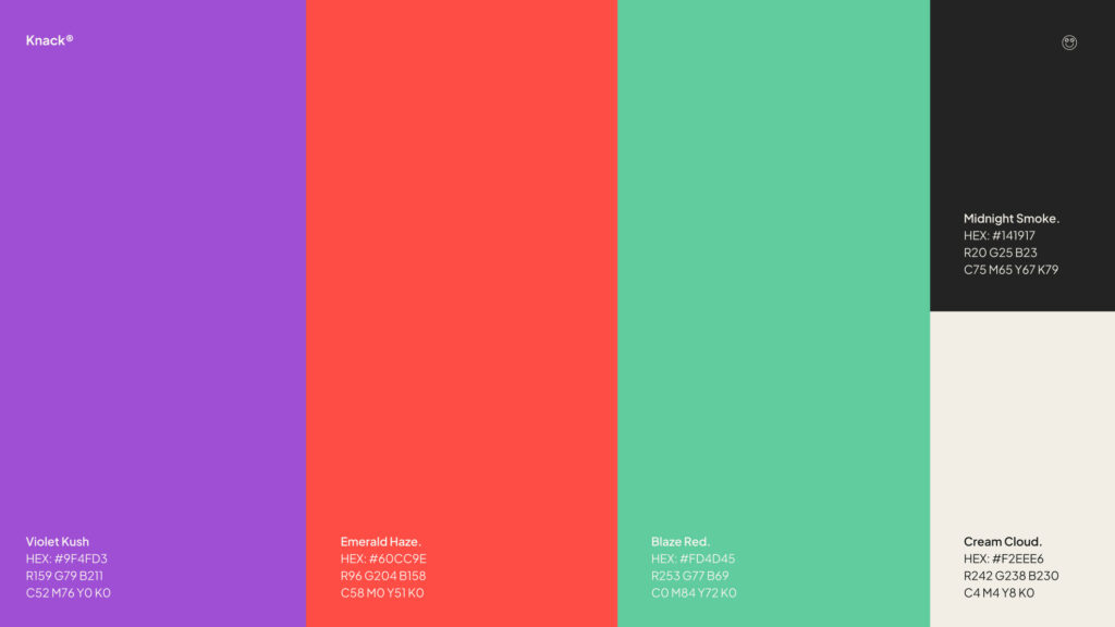
The Identity System
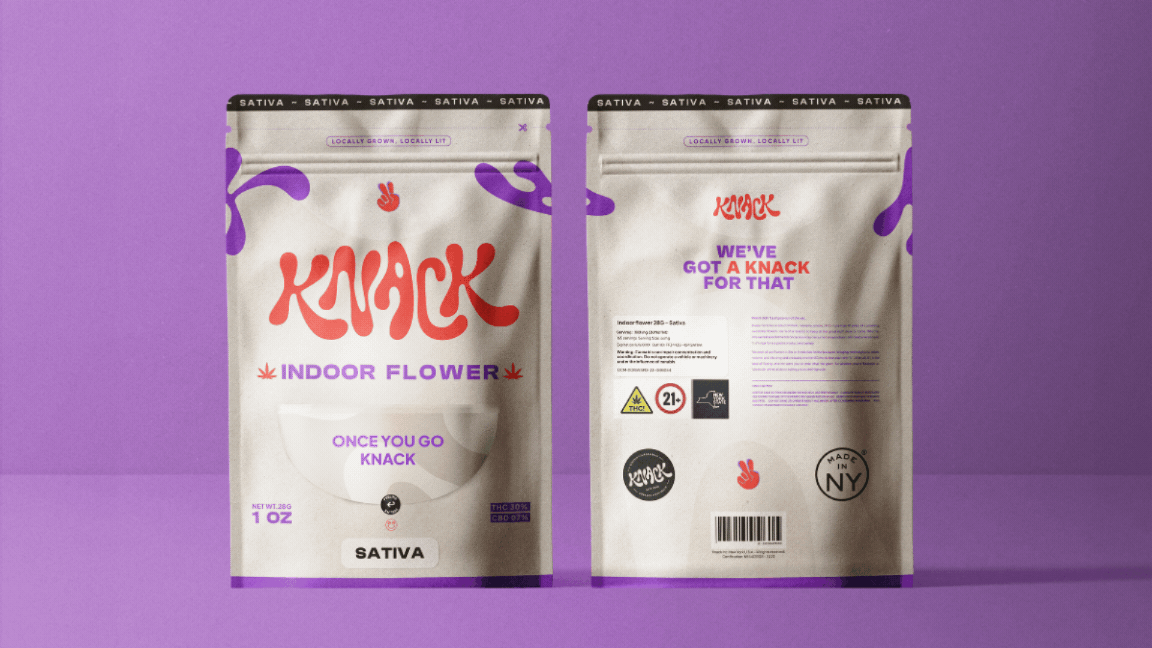
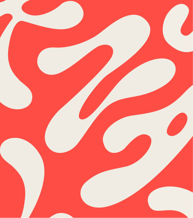
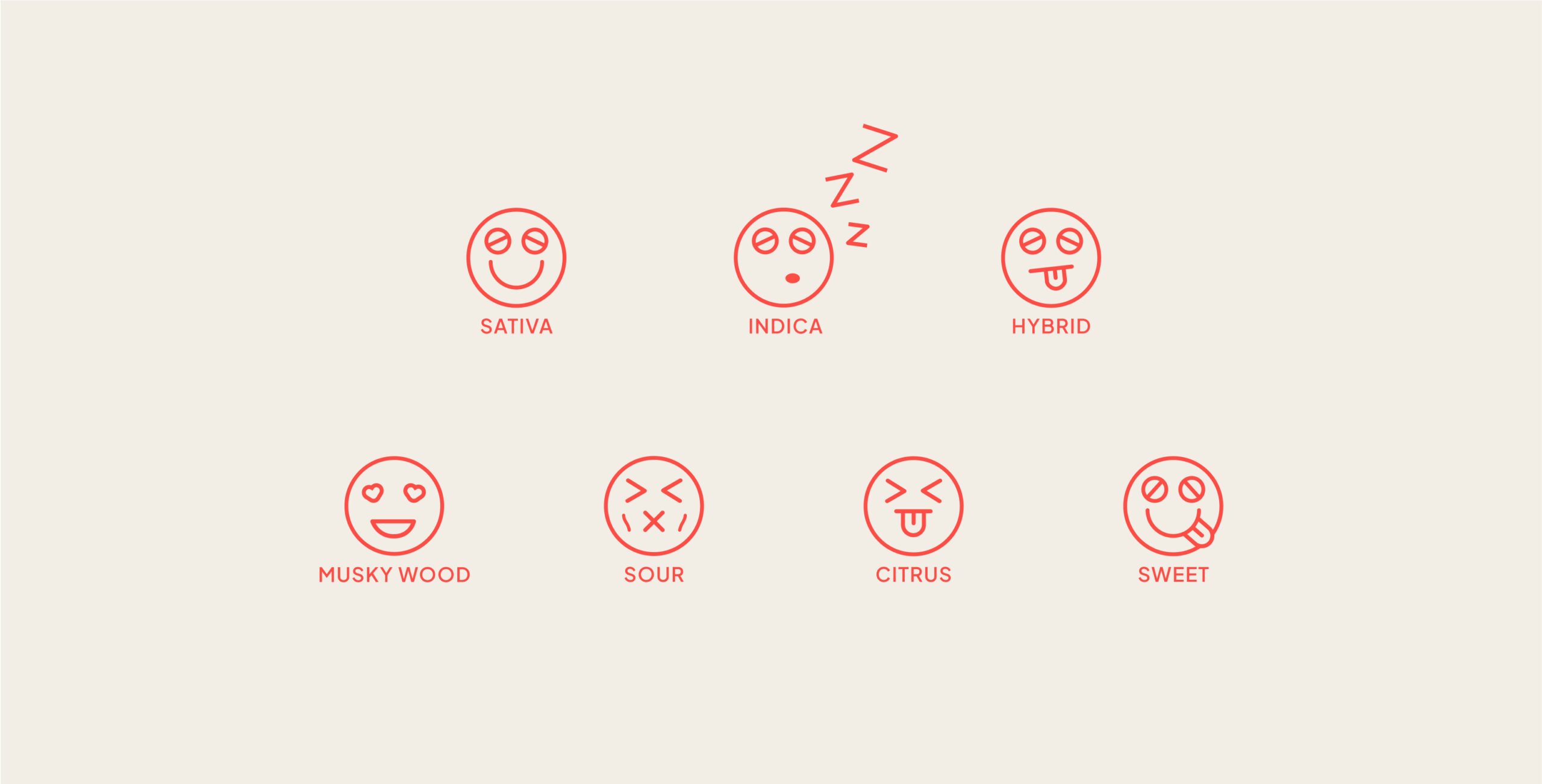
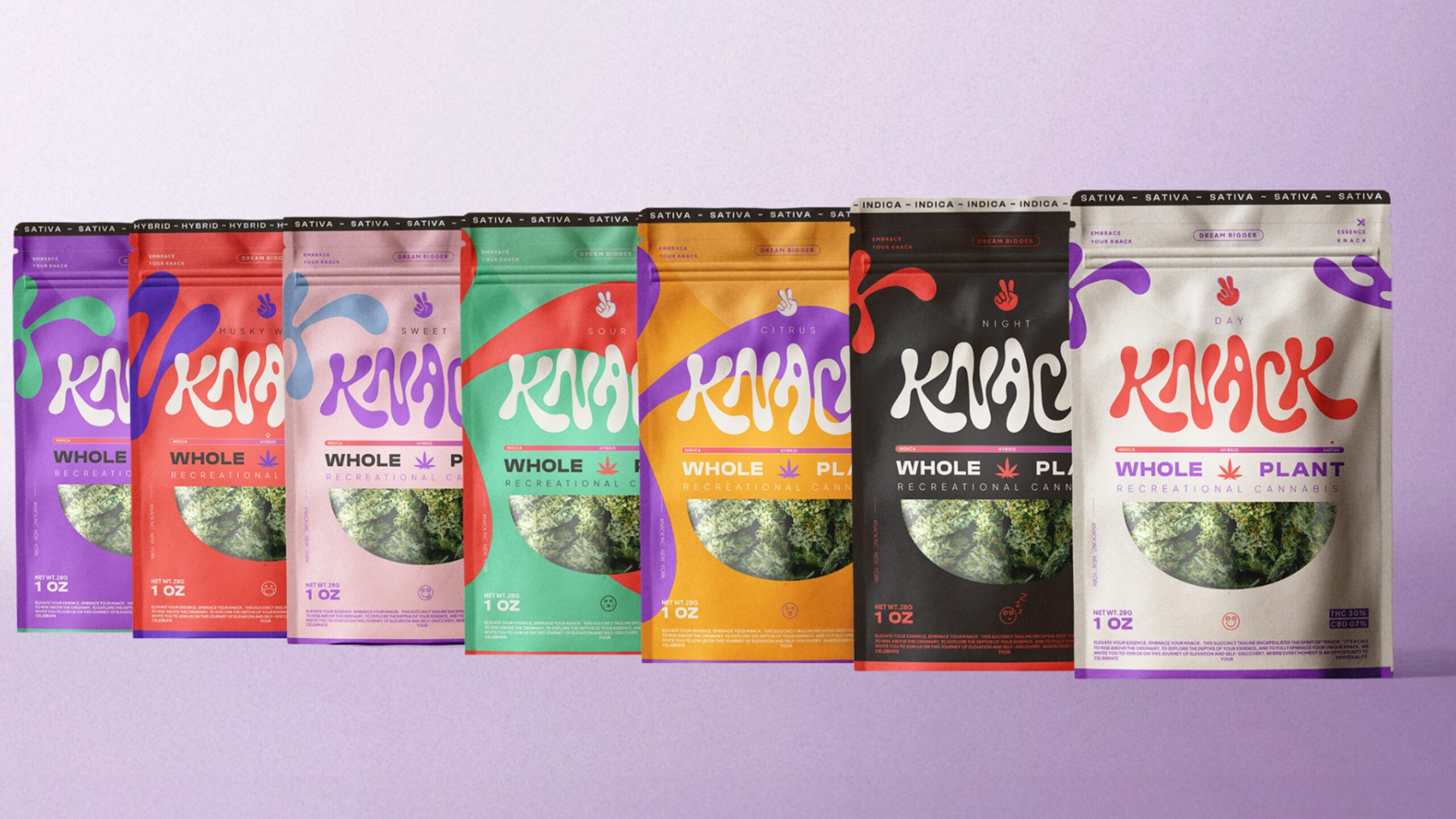
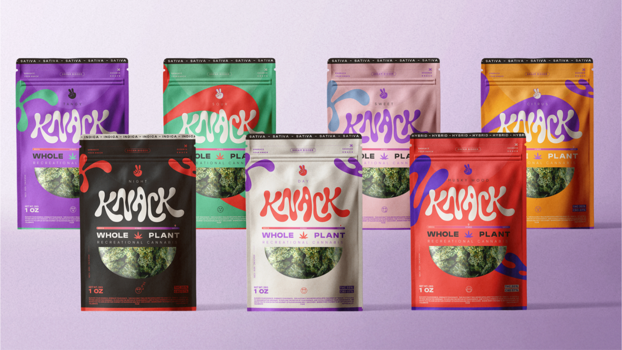
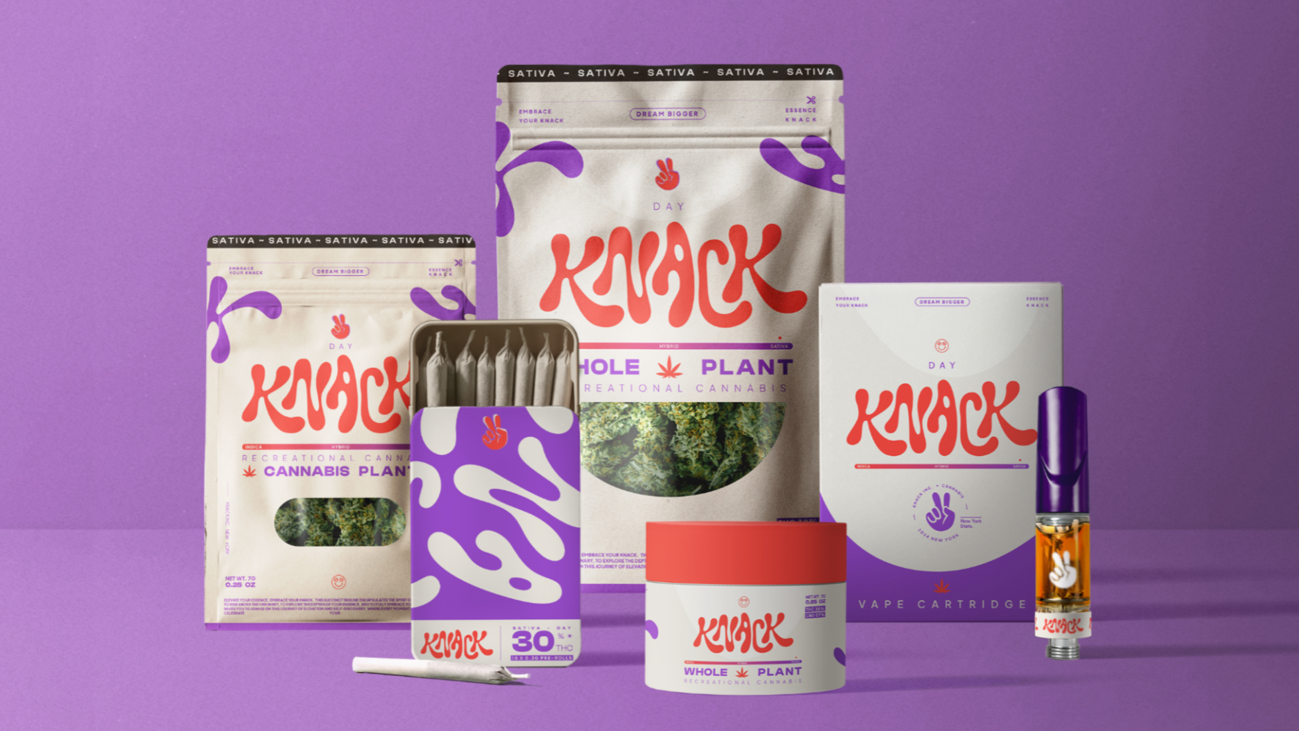
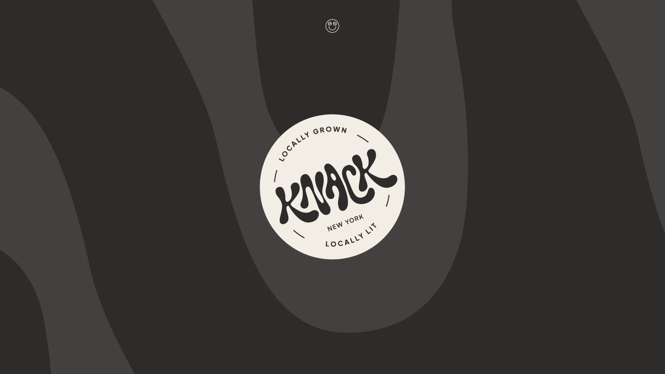
The visual identity is built around bold color, ownable typography, and a system that holds up across the strain variations and product formats Knack ships. The Adirondacks origin shows up as quiet provenance, not heavy-handed nostalgia. The brand reads contemporary, not craft-rustic.
Packaging direction was developed in partnership with Imagemme, who handled the production execution while we led the brand strategy and art direction.
Applications
Brand strategy and positioning. The strategic foundation that anchors Knack as a lifestyle brand with a New York identity.
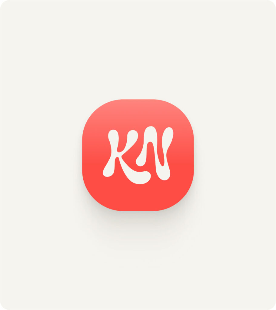
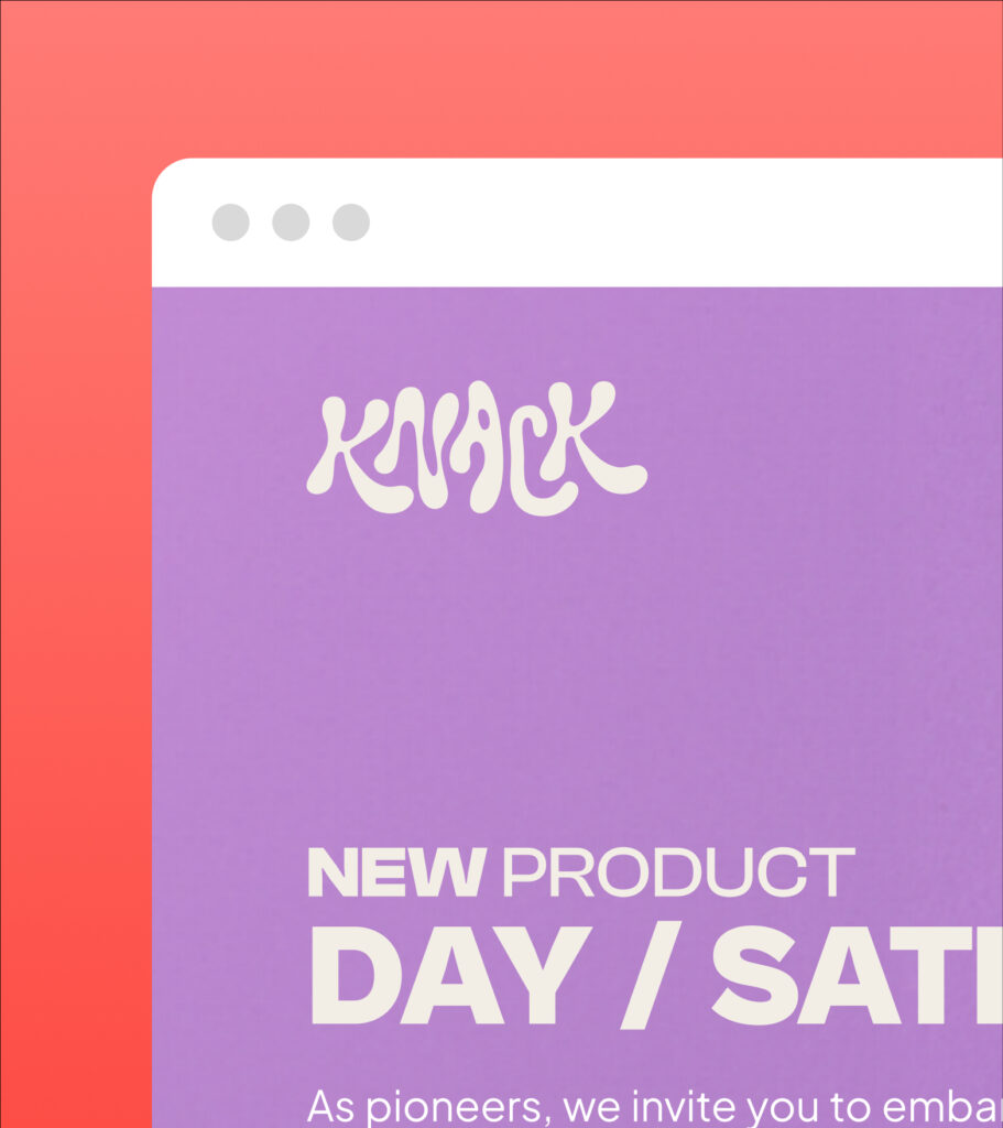
Visual identity. Logo, color, type, and the supporting system.
Packaging direction. Strategy and art direction developed in partnership with Imagemme.