The Challenge
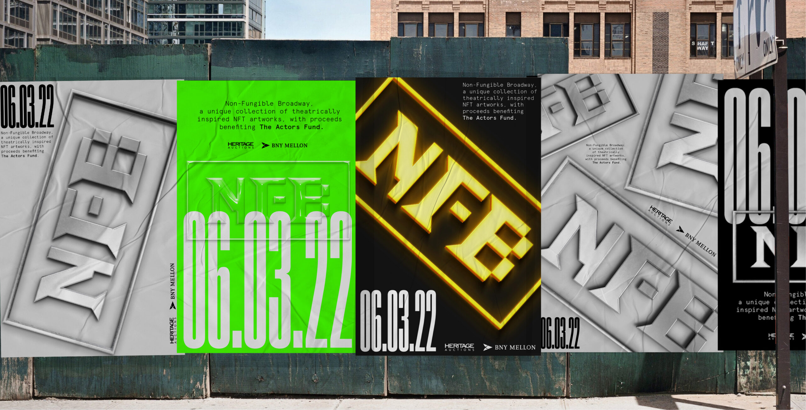
NFB sits at an intersection most categories haven't figured out how to talk about. Theater, blockchain, and NFTs are three languages that rarely share a conversation. The brief was a visual and promotional brand identity that could carry the cultural promise of theater while signaling the technical territory NFB was operating in.
The challenge was less about product and more about positioning the idea itself. The brand had to make the combination feel intentional, not improvised.
The Strategy
We anchored the work to one principle. The brand belongs to the cultural conversation first, the technical one second. NFB isn't blockchain for theater. NFB is theater operating in a new infrastructure layer.
That principle gave the visual system its starting point. Lead with culture. Let the technical territory show up as context, not category.
The Work
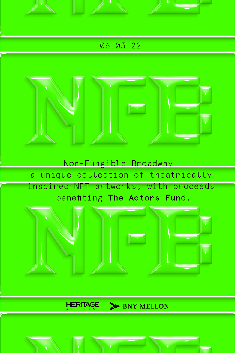
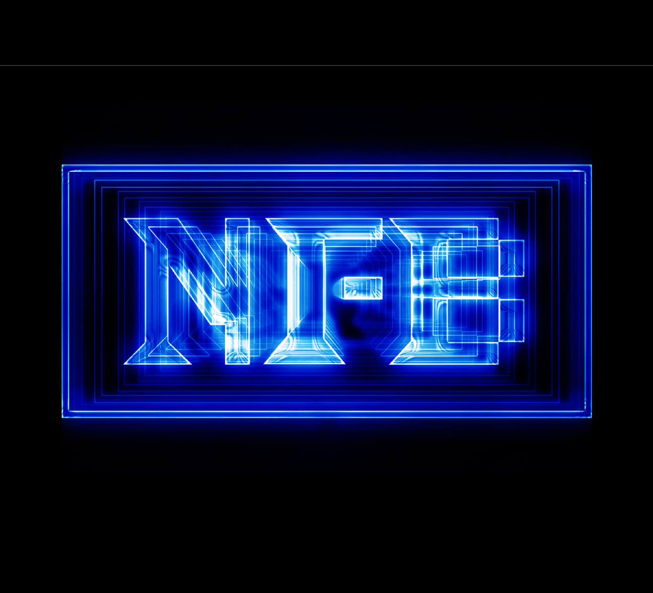
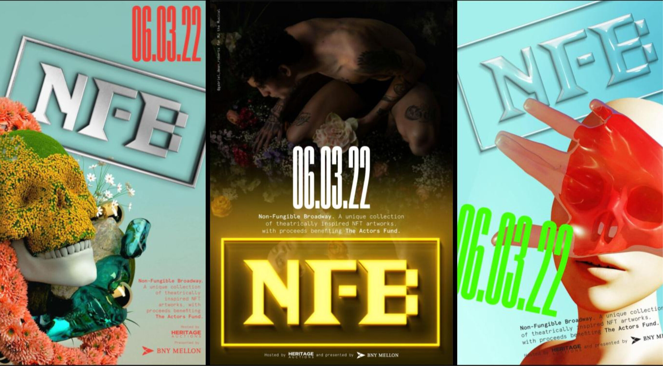
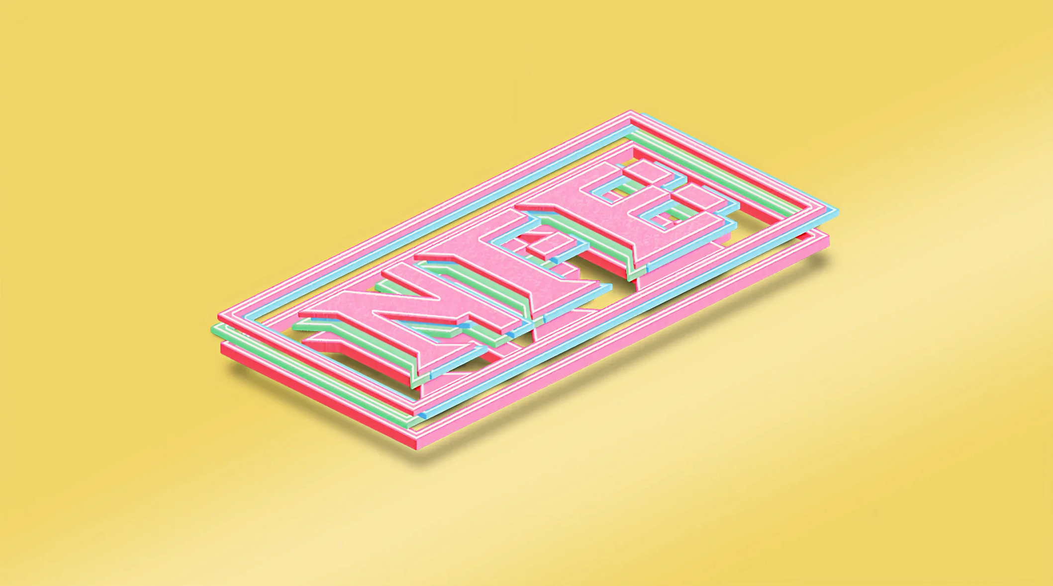
The visual identity was built to read culturally first. Typography carries the weight of editorial design rather than the geometry of crypto. The mark and the supporting graphic language are designed to live in the spaces theater audiences and blockchain audiences both recognize. Color, type, and motion are set up for visual and promotional contexts. The system was built as a contained brand expression for the project's launch and ongoing promotional surfaces.