The Challenge
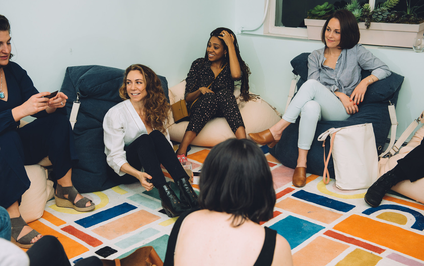
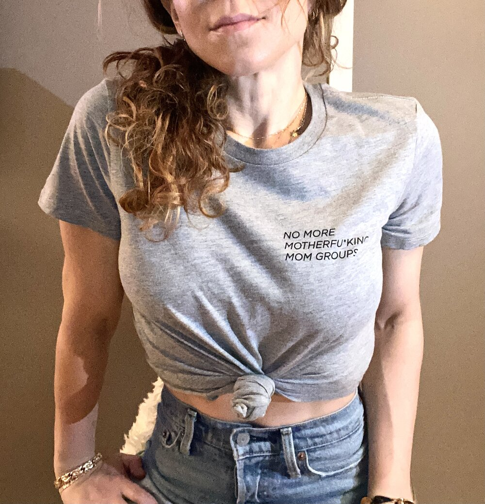
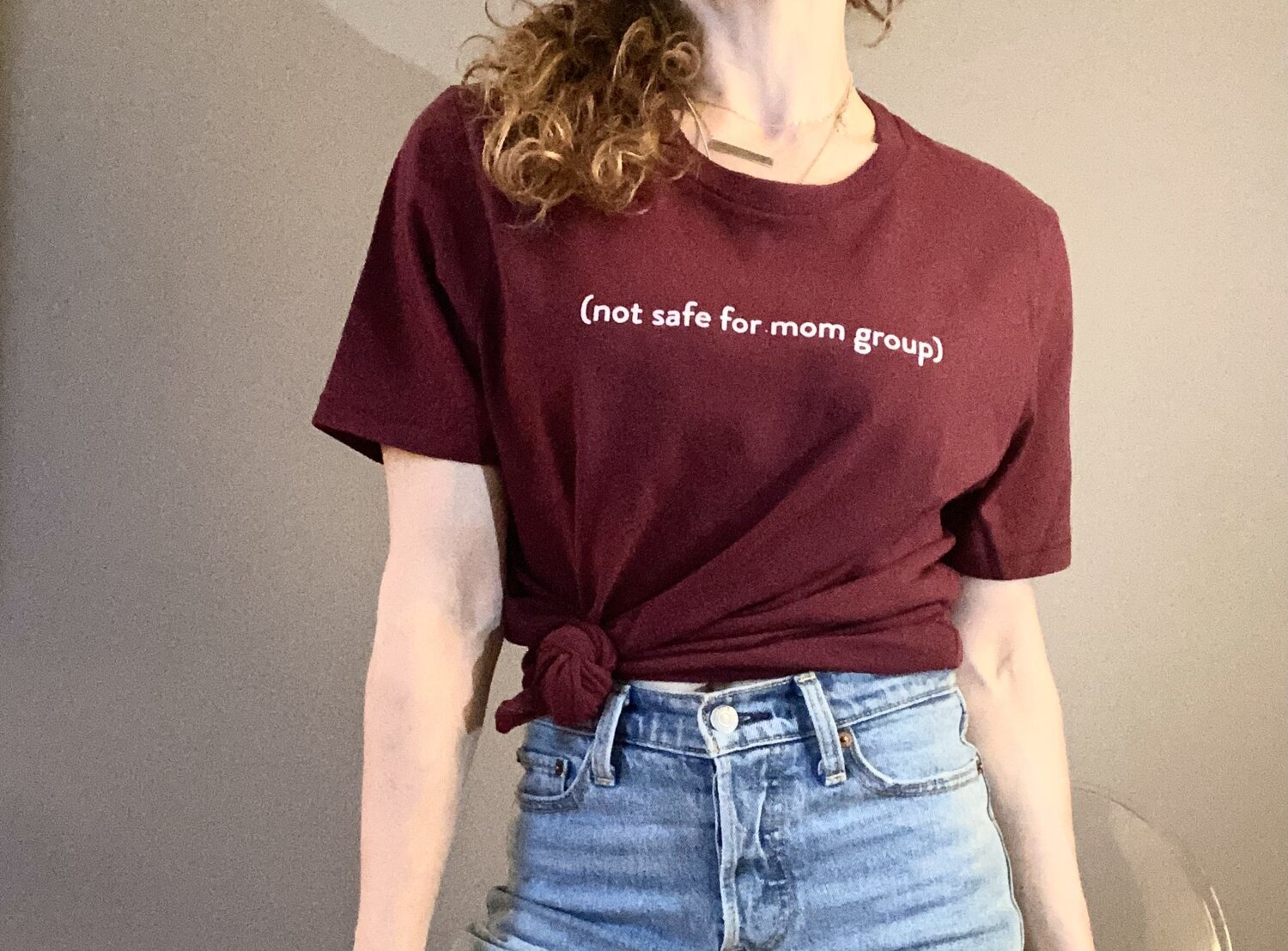
Not Safe for Mom Group came to us with a founder, Alexis, who had built a community with a real point of view. The brand needed to match the personality of the founder and the community. Distinct, captivating, and willing to take a position the broader category wouldn't.
The Strategy
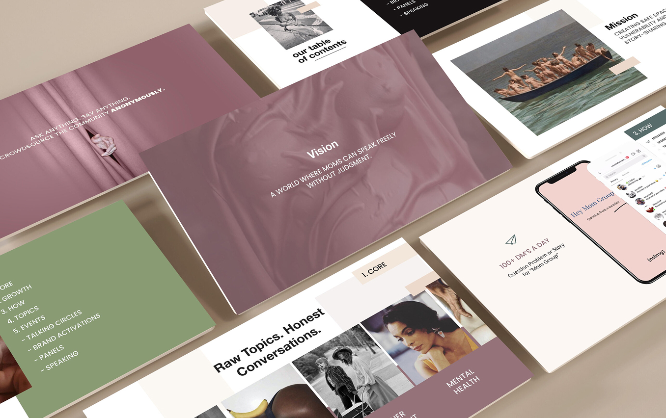
We anchored the work to one principle. The brand should reflect the founder's voice and the community's energy, not the conventions of the category. Personality as positioning. Confidence as the through-line.
The Work
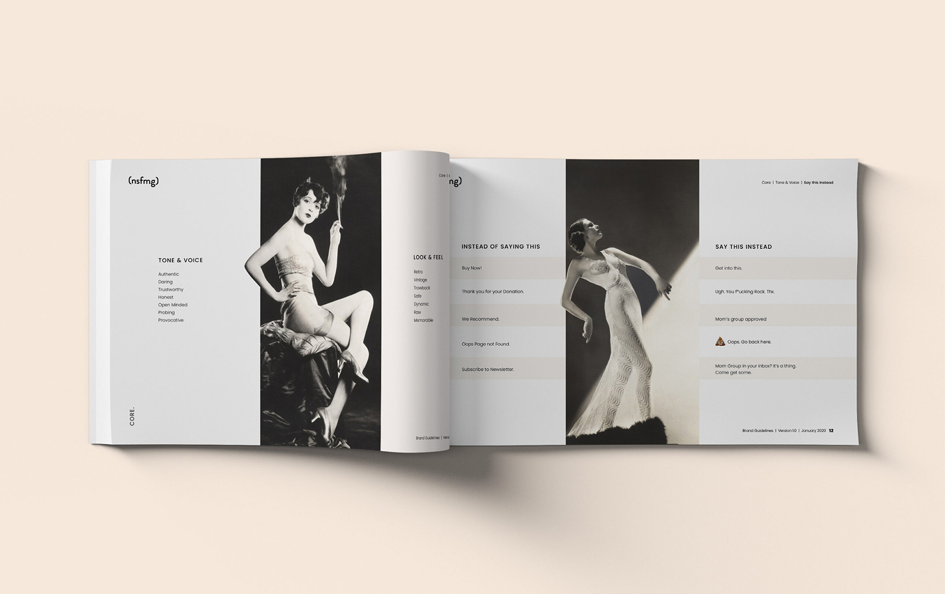
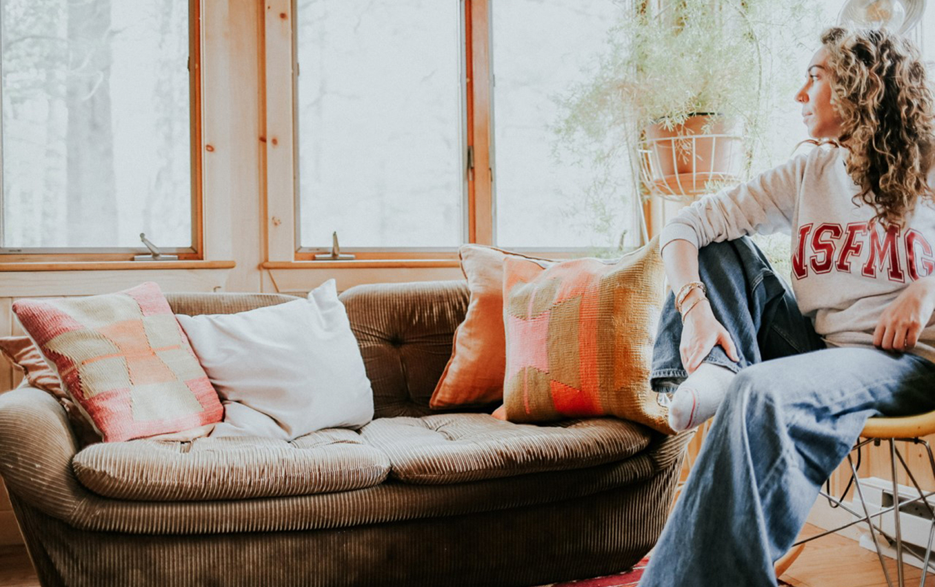
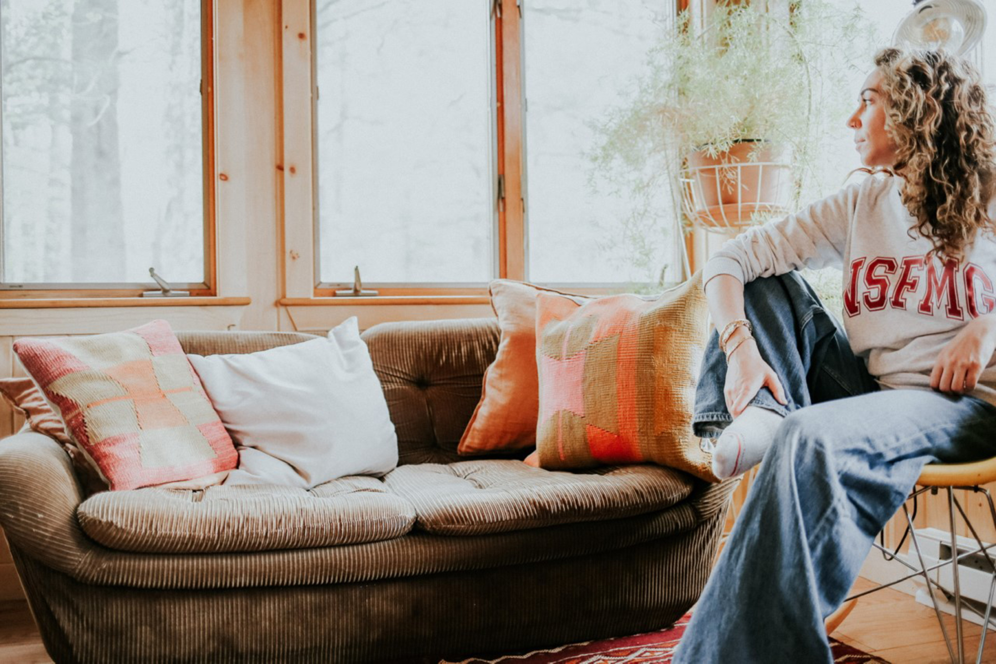
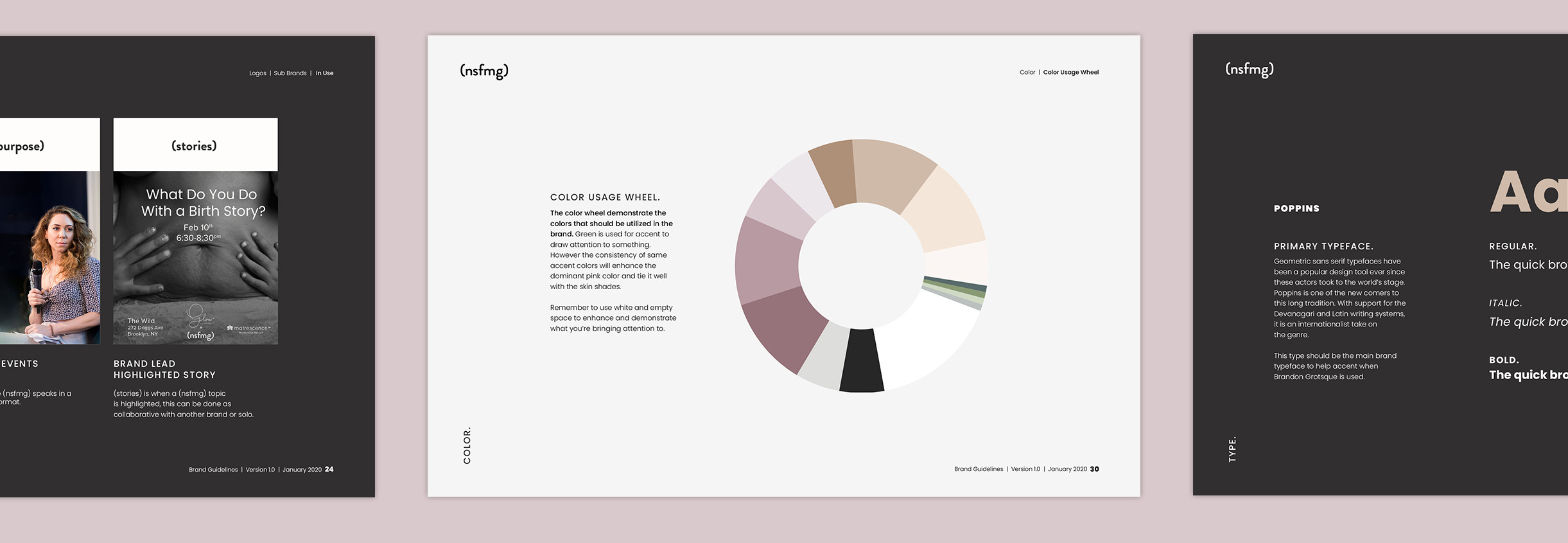
The visual identity is built to read as a community brand, not a corporate one. Color, typography, and the supporting system carry the founder's voice into a system designed to scale with the community across the touchpoints where the community actually lives.
The Result
The brand build supported exponential growth for Not Safe for Mom Group, giving the community a visual identity that matched the energy of the founder and the audience.