The Challenge
Open Camps entered the digital outdoor advertising category with a clear position and a clear product. The category moves at the speed of media buying, which is faster than most categories operate. Buyers compare options, allocate spend, and launch campaigns inside cycles measured in days, not weeks. The brand had to translate the position and the product into a system that lands in that compressed window.
The Strategy
We anchored the work to one word.
A single-word brand line is a discipline. It forces the brand to deliver everything else in the system, because the line itself only opens the door. Open Camps is the platform that helps a buyer learn what's actually working in digital outdoor, then act on it. The discipline of holding the line to one word forced every other surface, every visual decision, and every piece of copy to carry the weight the line couldn't.
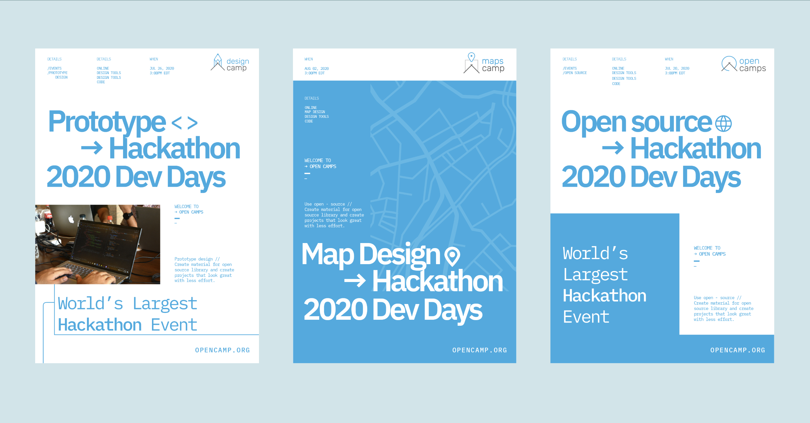
The Work
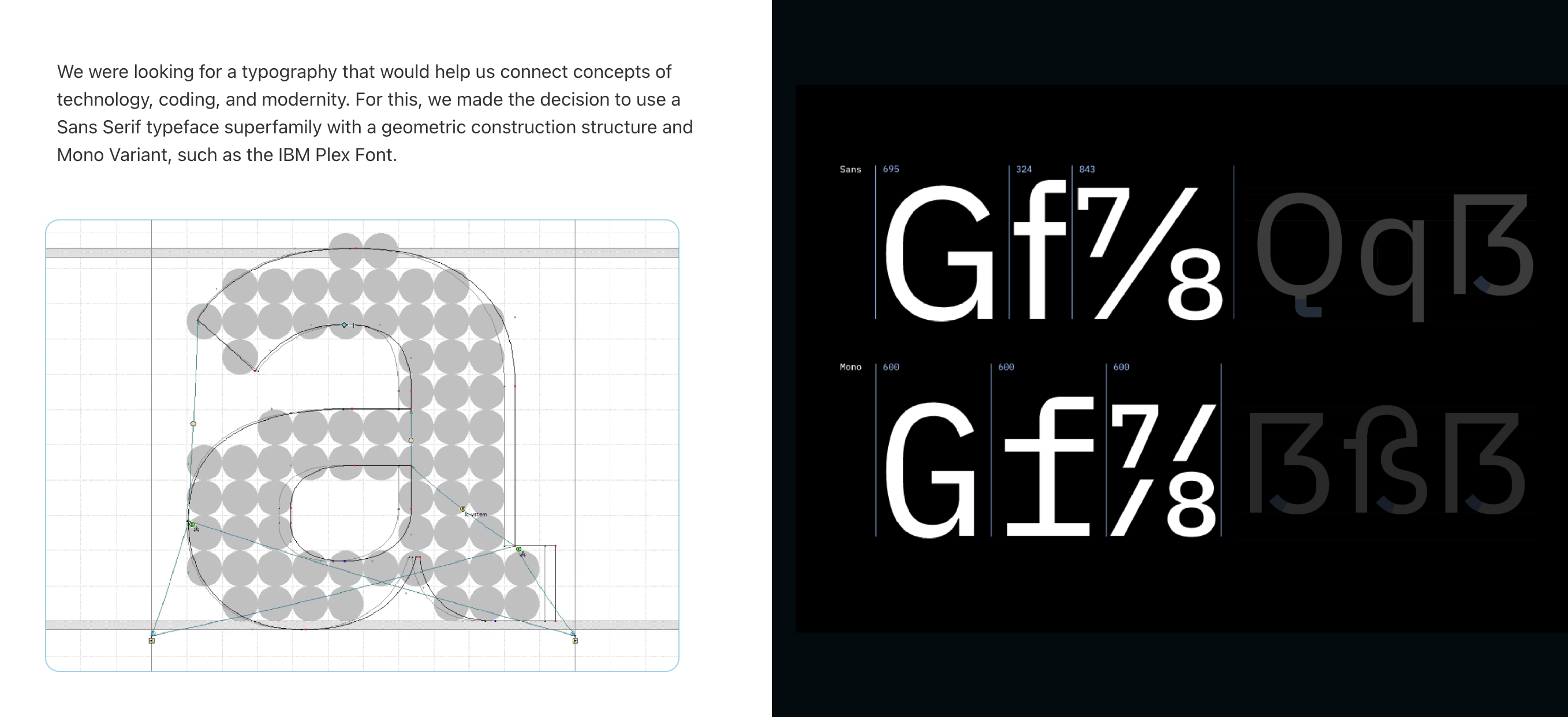
The visual identity is built around clarity and a confident posture. Typography and color are calibrated for the speed the category operates at. The system carries from the marketing site into the product surface where buyers do the learning the brand promises, which means the marketing language and the product experience stay in one register without an awkward handoff.