JLL, one of the most prominent global real estate services firms in the world, needed a brand identity for Orchard, a sub-brand operating inside the parent firm's broader platform. Sub-brand work is a discipline where the wrong call in either direction breaks both brands. Lean too far into the parent and the sub-brand disappears. Lean too far away and the sub-brand loses the parent's credibility, which is the reason the sub-brand exists in the first place.
The work had to do two things at once. Carry enough of the JLL brand to feel native to the parent. Stand on its own enough to do the work Orchard specifically needed to do.
The Strategy
We anchored the work to one principle. Orchard is JLL, but Orchard is also Orchard. The brand had to live inside the parent without disappearing into it. Sub-brand architecture is a discipline of restraint. Carry what's needed from the parent. Build what's needed for the sub-brand. Resist anything that belongs to neither.
The Work
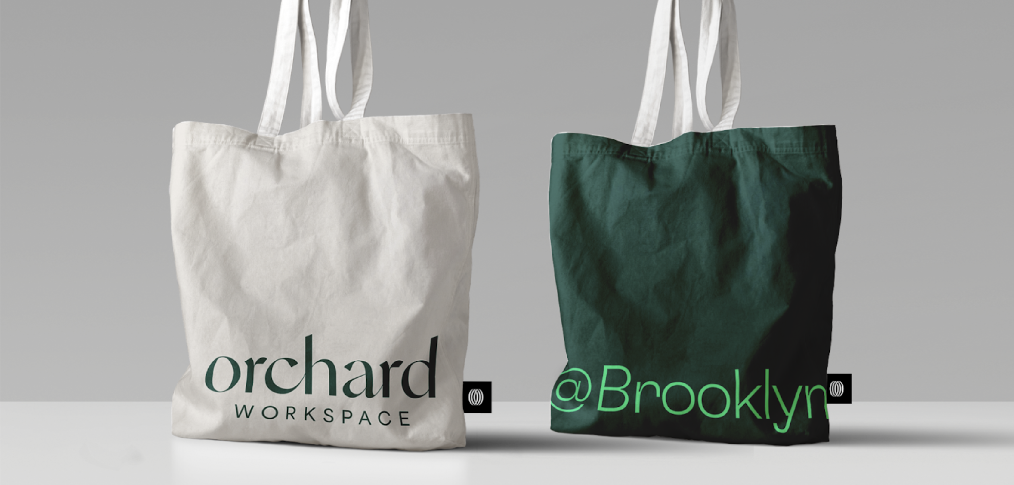
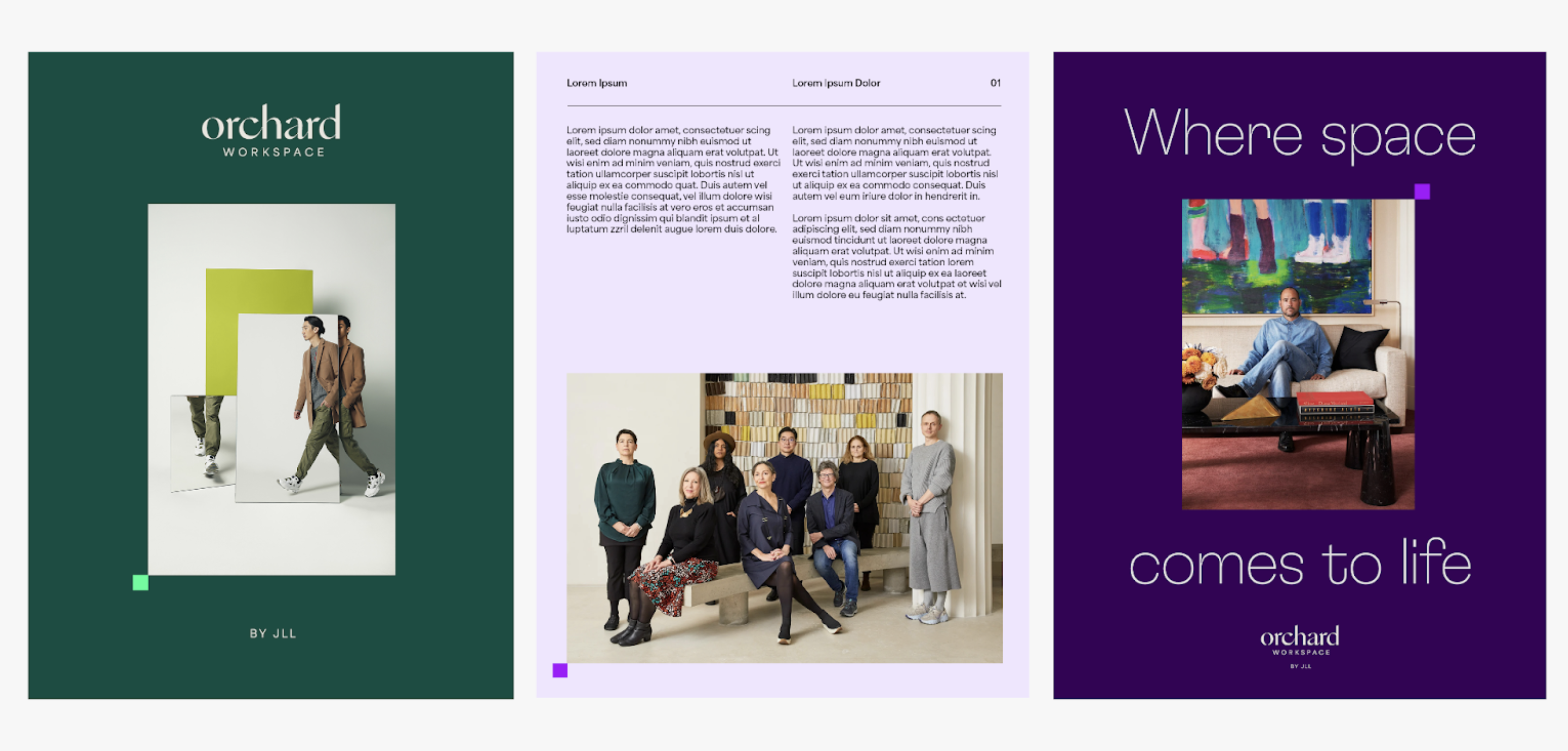
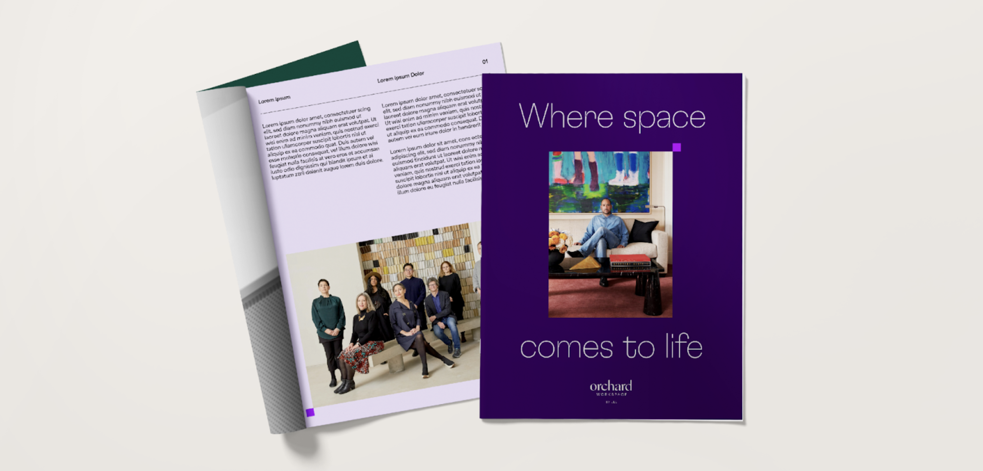
The visual identity sits inside JLL's brand architecture while carrying its own distinct expression. Color and typography reference the parent brand without copying it. The mark gives Orchard its own visual signature while reading clearly as part of the JLL family. Brand architecture rules govern how the two appear together and apart across surfaces, which is what keeps both brands clear as Orchard scales inside JLL's broader platform.