The Challenge
Ronini entered the category with a clear product position. Safety-first, designed for a new generation of consumers. The category defaults skew either utilitarian (industrial design language that signals "this works" without warmth) or overdesigned (aesthetic-led brands that signal "this is fashionable" without trust). Neither serves a buyer choosing on safety.
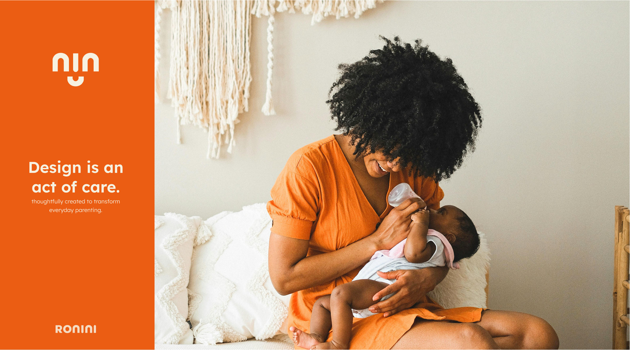
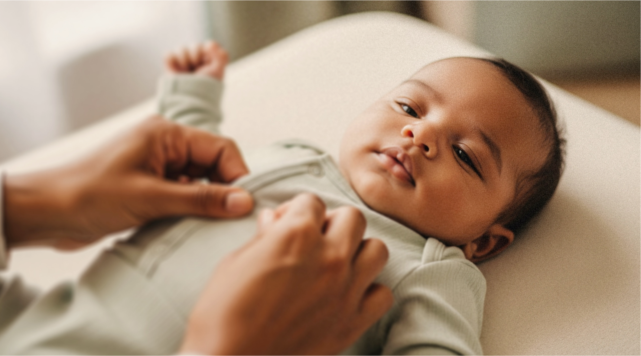
The brand had to lead with confidence in the product and warmth in the relationship. Safety as a category benefit only matters if the buyer trusts it, which means the brand has to read as honest about safety rather than performatively safe.
The Strategy
We anchored the work to one principle. Safety isn't a feature to add to a brand, it's a posture to lead with. The visual and verbal identity had to read as trustworthy on first contact, with the confidence a safety-led category buyer is actually looking for. Every decision in the system had to support that posture, because anything that read as decorative would undermine the safety claim.
The Work
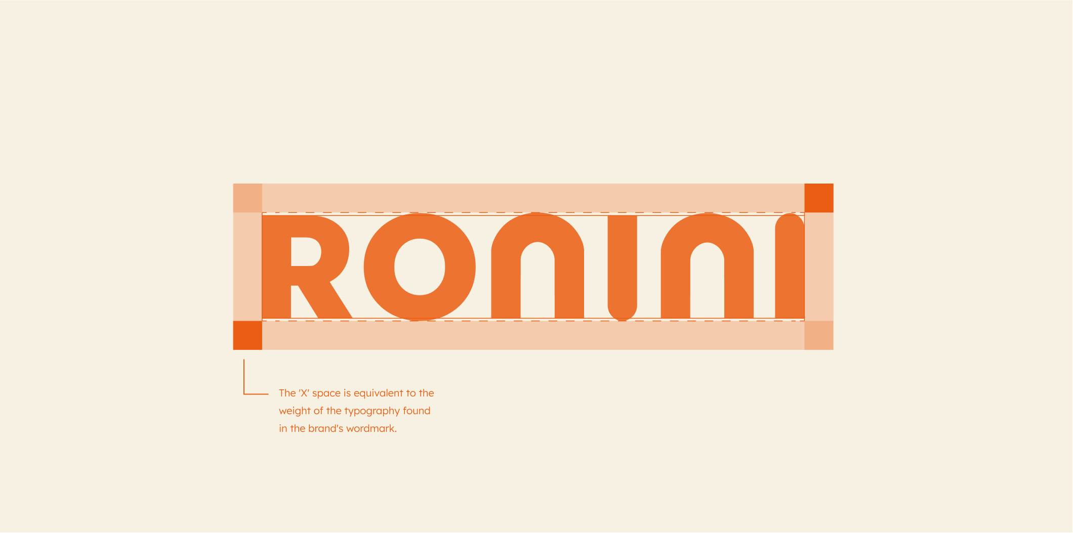
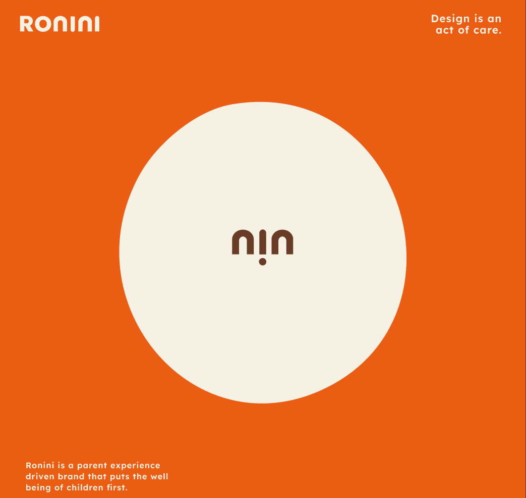
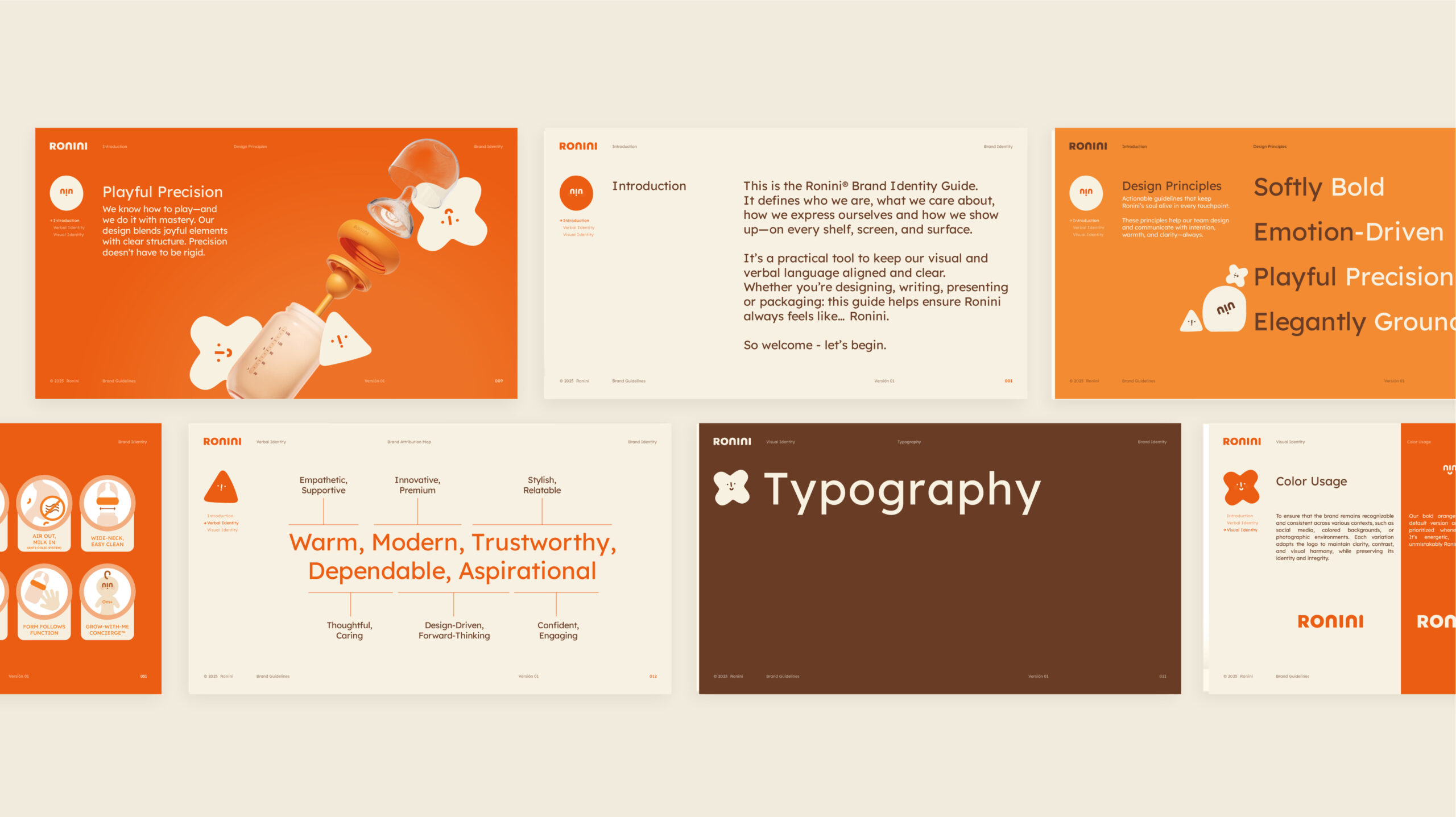
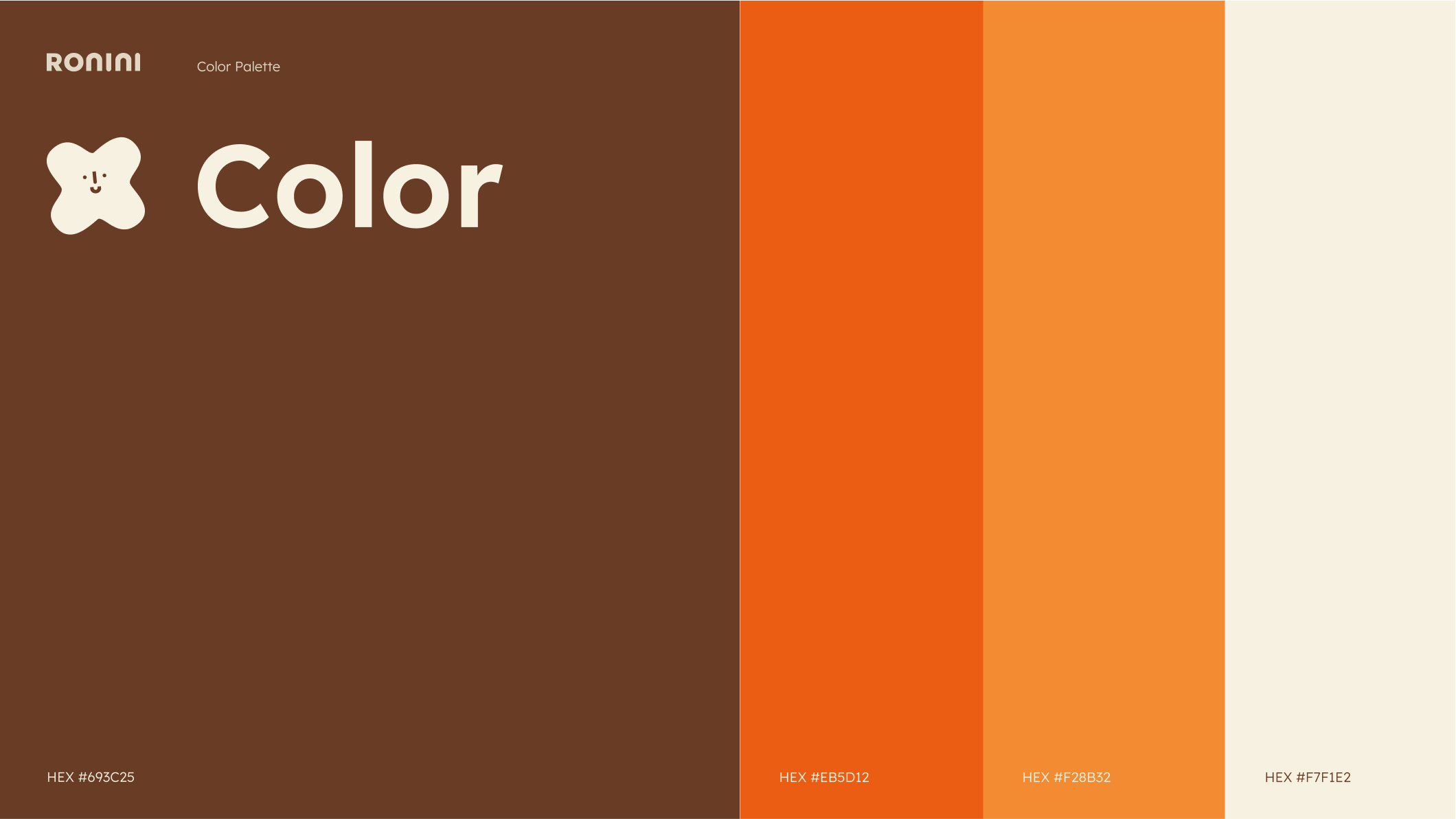
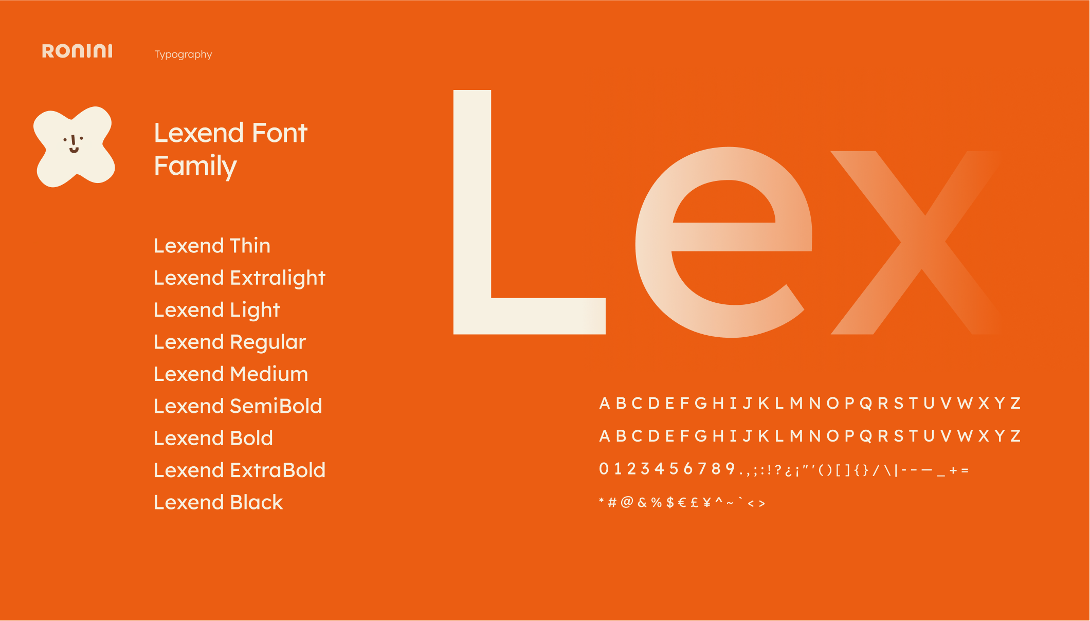
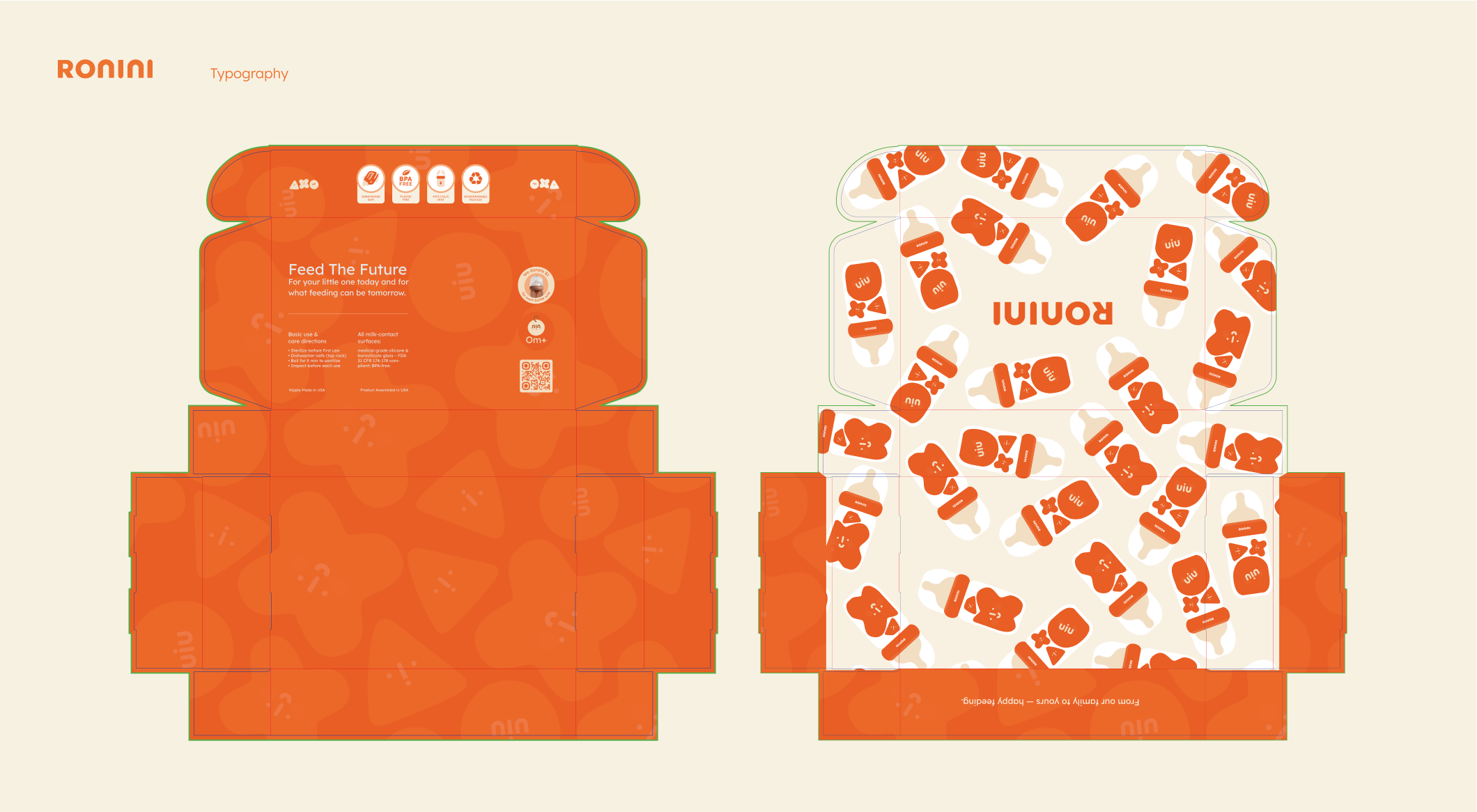
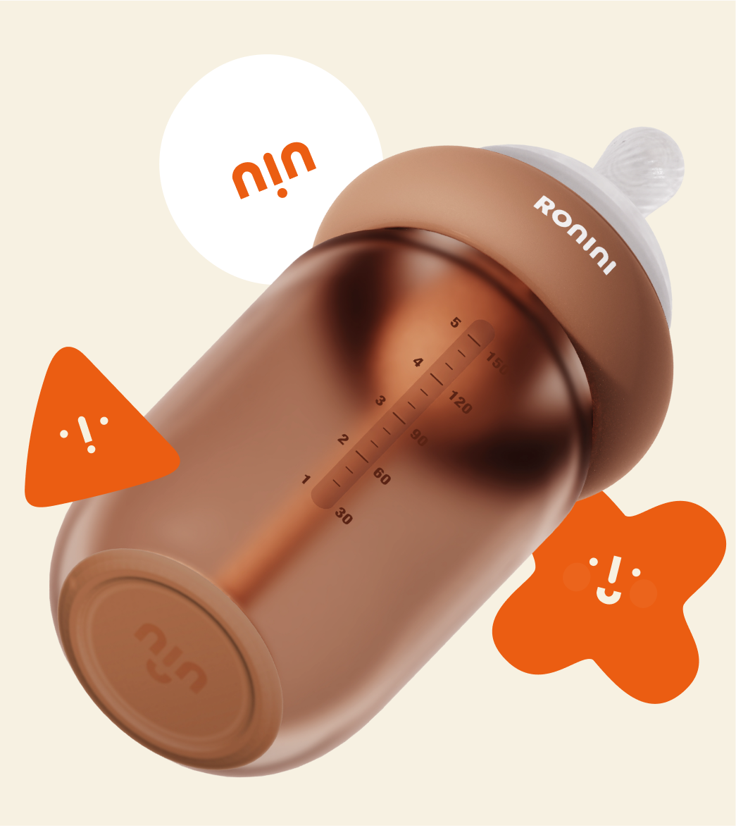
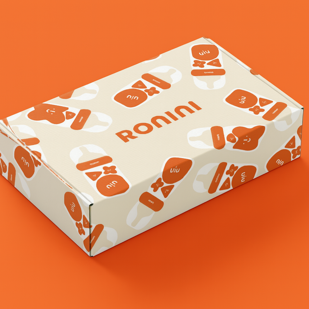
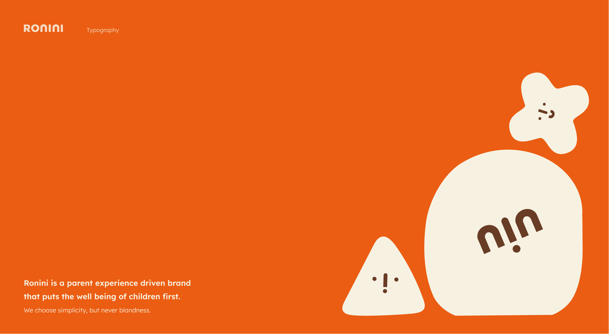
The visual identity carries warmth and clarity. Color, typography, and the supporting system are calibrated to read as safe and contemporary at the same time. The system avoids both category traps. It isn't industrial-utilitarian, which would feel cold for a new generation of consumers. It isn't aesthetic-led overdesign, which would undermine the safety positioning. It sits in the narrow middle that lets safety read as the headline without losing the relationship. Packaging direction was developed in partnership with Imagemme.