Why We Built It
Most brand work treats the archetype as a finish line. Pick the Hero, or the Sage, and call the strategy done.
We think that is where the work starts. The assumption is that looking within reveals your most competitive self. It misses the full picture.
The Framework
Finding your archetype is an internal exercise. Finding its competitive advantage is not.
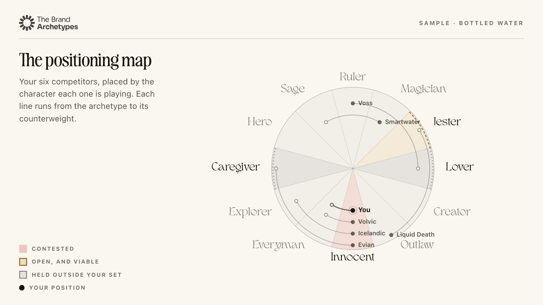
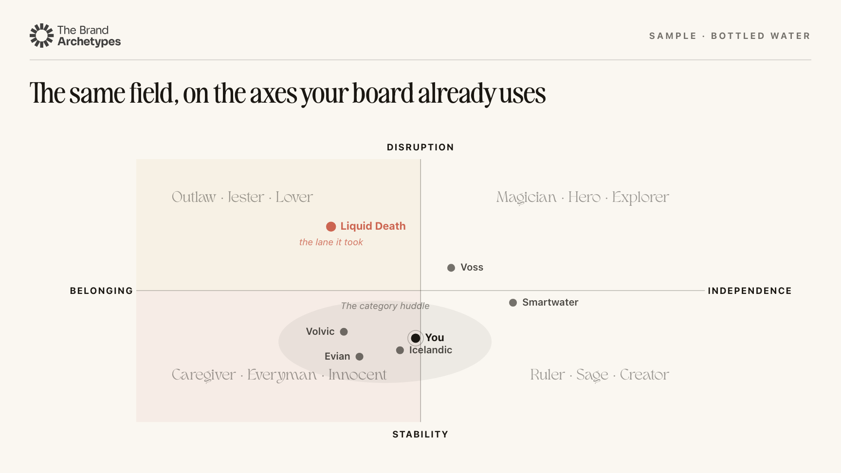
That answer sits outside the building, in the category, the competition, and the positions already taken. So we built the framework to treat archetypes as dynamic rather than fixed. Markets move, competitors move, and a distinctive idea becomes a category convention. The character a brand needs to play can change with them.
What It Is
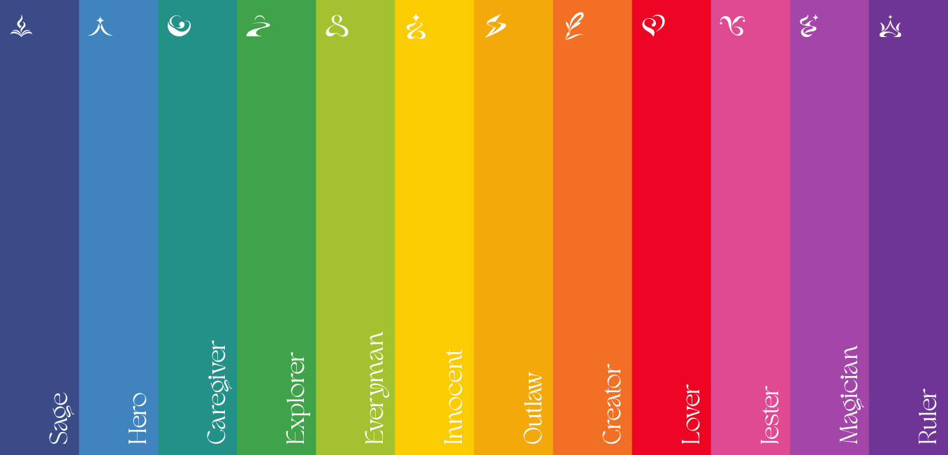
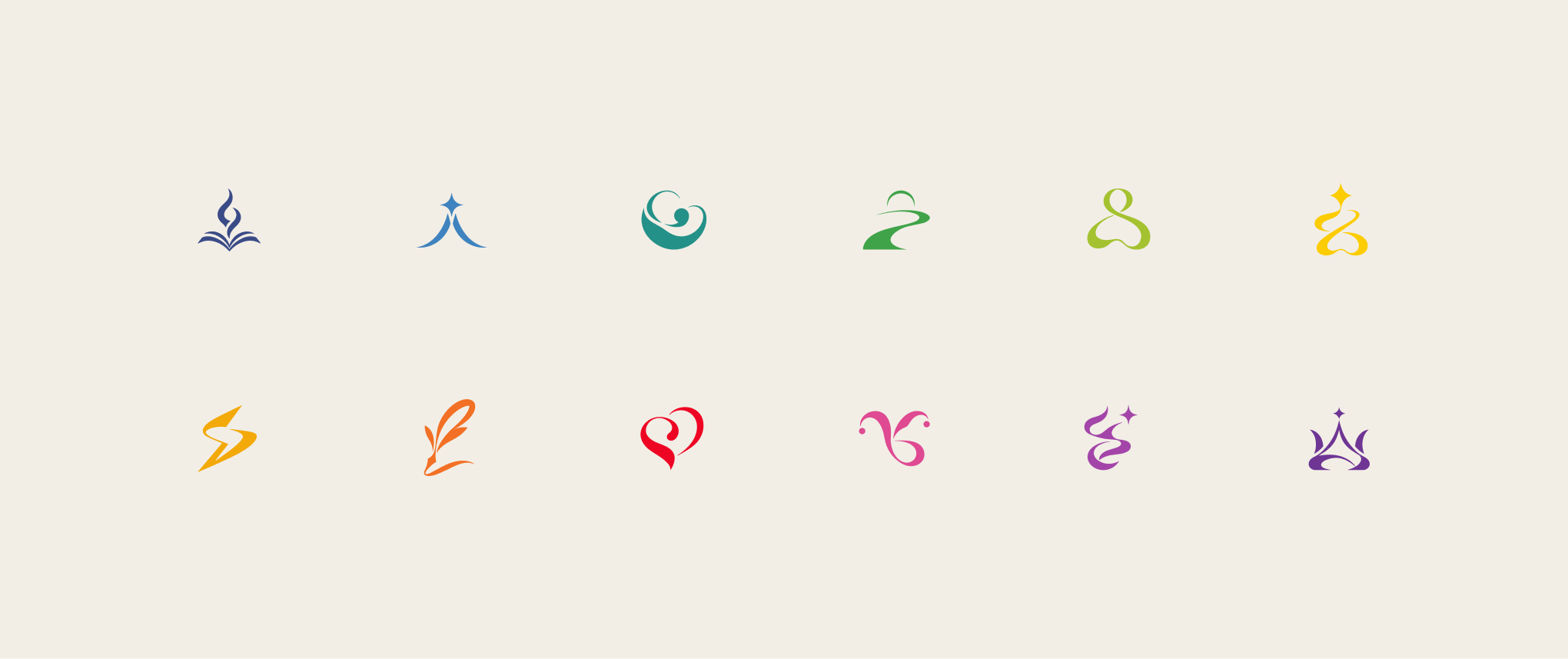
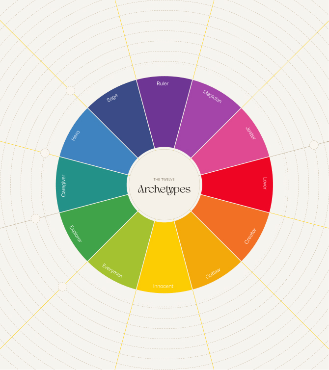
Twelve archetypes, each with its own color, icon, and character, arranged on a single wheel.
You find the one that fits, and the tool carries it forward into how the brand should sound, look, and behave across five surfaces: name, verbal identity, visual identity, experience, and behavior.
What We Made
The concept and naming. An editorial identity.
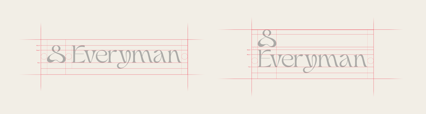
A twelve-color spectrum, one hue per archetype. A full icon set. The archetype wheel and color map. The motion. Forty-eight brands read against the framework. And the site itself.
Where It Lives
thebrandarchetypes.com, where it anchors the studio's Brand Diagnostic.
We also took it apart on Position to Win.