The Challenge
The Neuron had built what the rest of the digital out of home category was trying to catch up to. A global network of catalogs powering the world's largest DOOH database, turning static screens into dynamic, data-driven media. The product was years ahead of every competitor. The brand wasn't translating that lead.
As the network grew and the customer roster moved up market, the gap widened into a real commercial problem. DP World, Dubai Tourism, NBC, Royal Jordanian, Shein, Swatch, and Versace expected a brand that matched the sophistication of the technology behind it. The Neuron's brand was reading at the altitude of a media network when the buyers were treating it as software infrastructure. Every conversation started from a step behind.
The Strategy
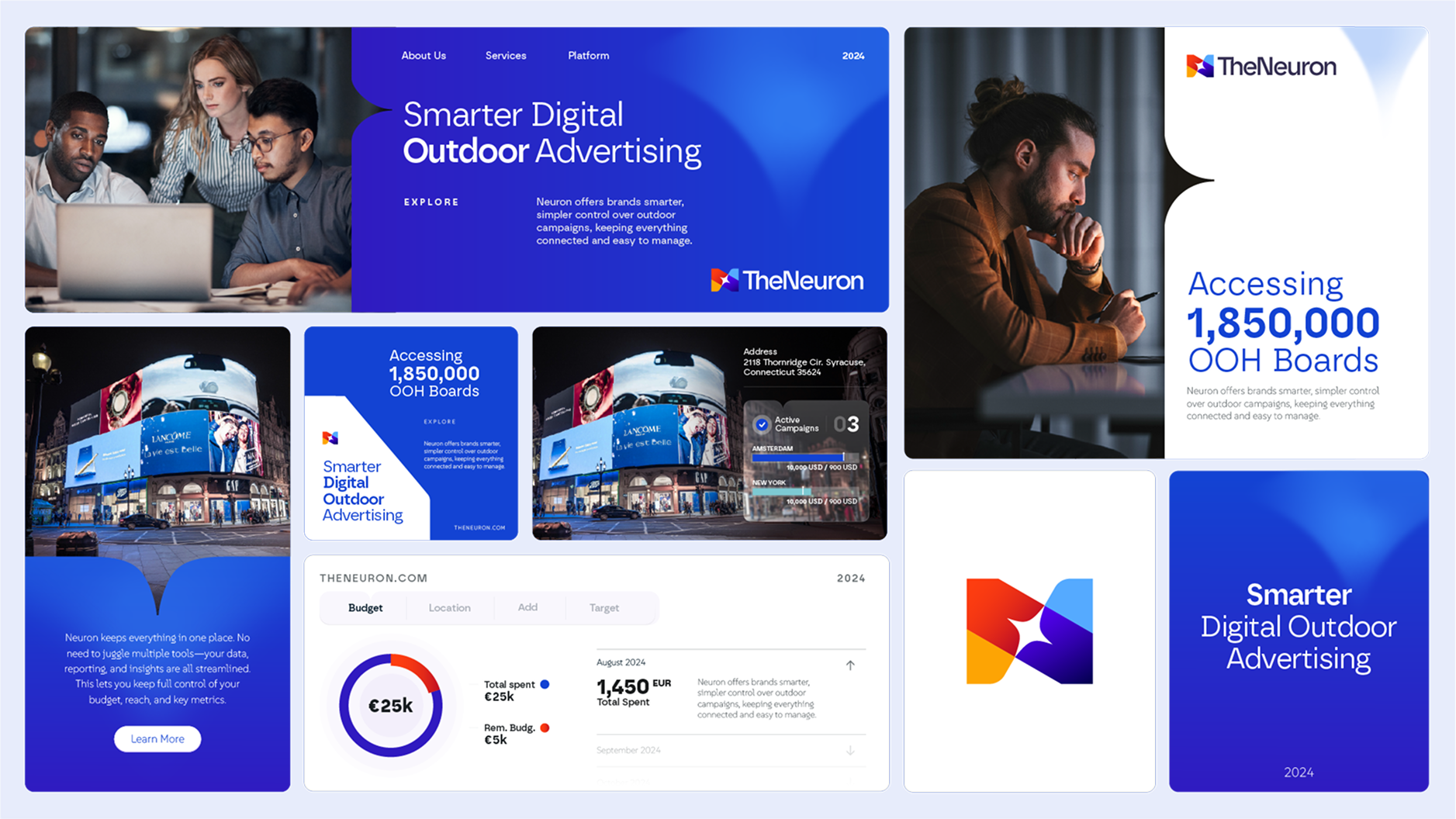
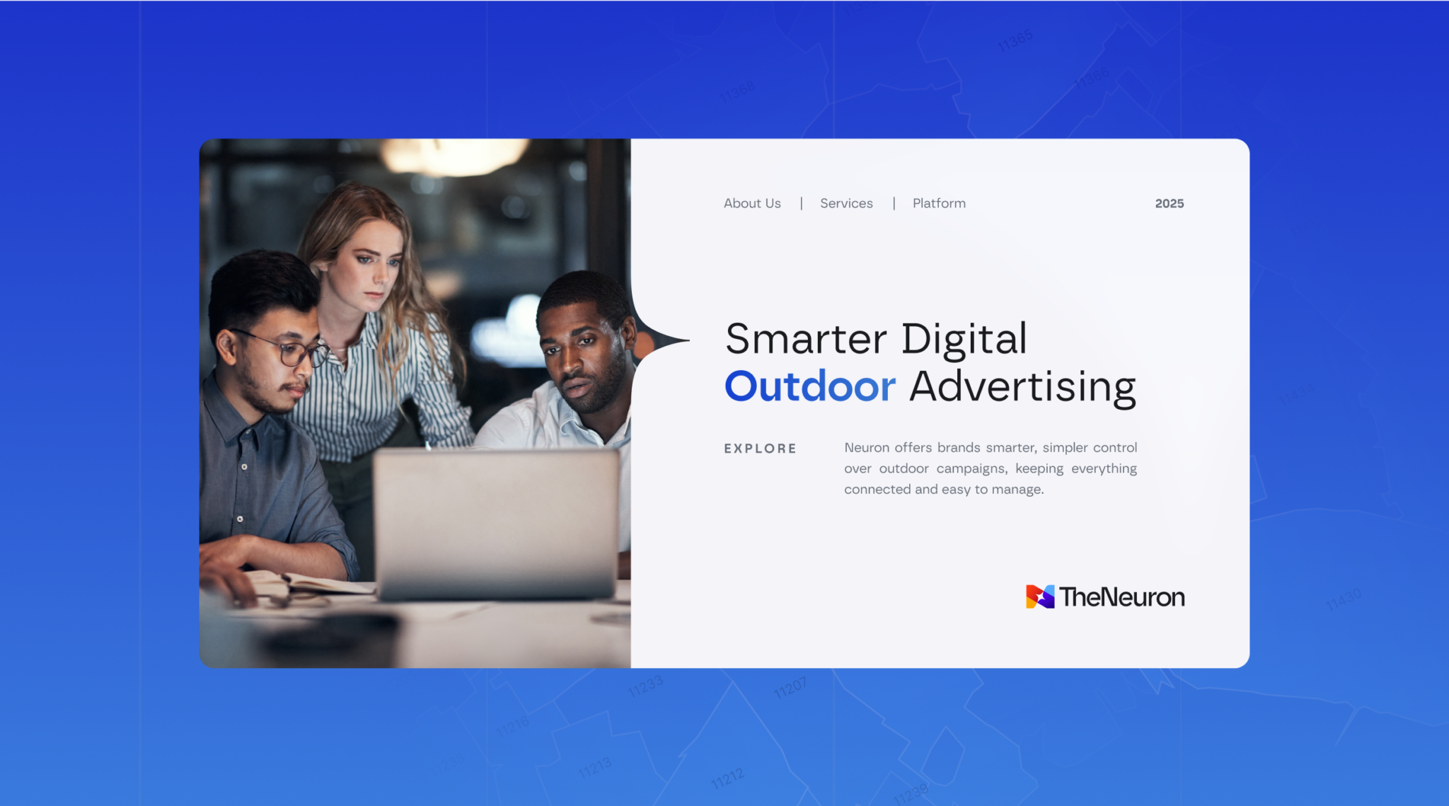
The strategic move was to compress the product story to one line. "Smarter Digital Outdoor Advertising." Not faster. Not bigger. Smarter.
Smarter is a claim that holds up only if the product proves it. The Neuron's product does. So the brand could lean all the way into a category-defining promise without overreaching. From that single line, every other decision followed. The brand had to read as software first, media second. The marketing site had to demonstrate the product, not describe it. Every surface had to feel native to a buyer evaluating The Neuron against the rest of their tech stack.
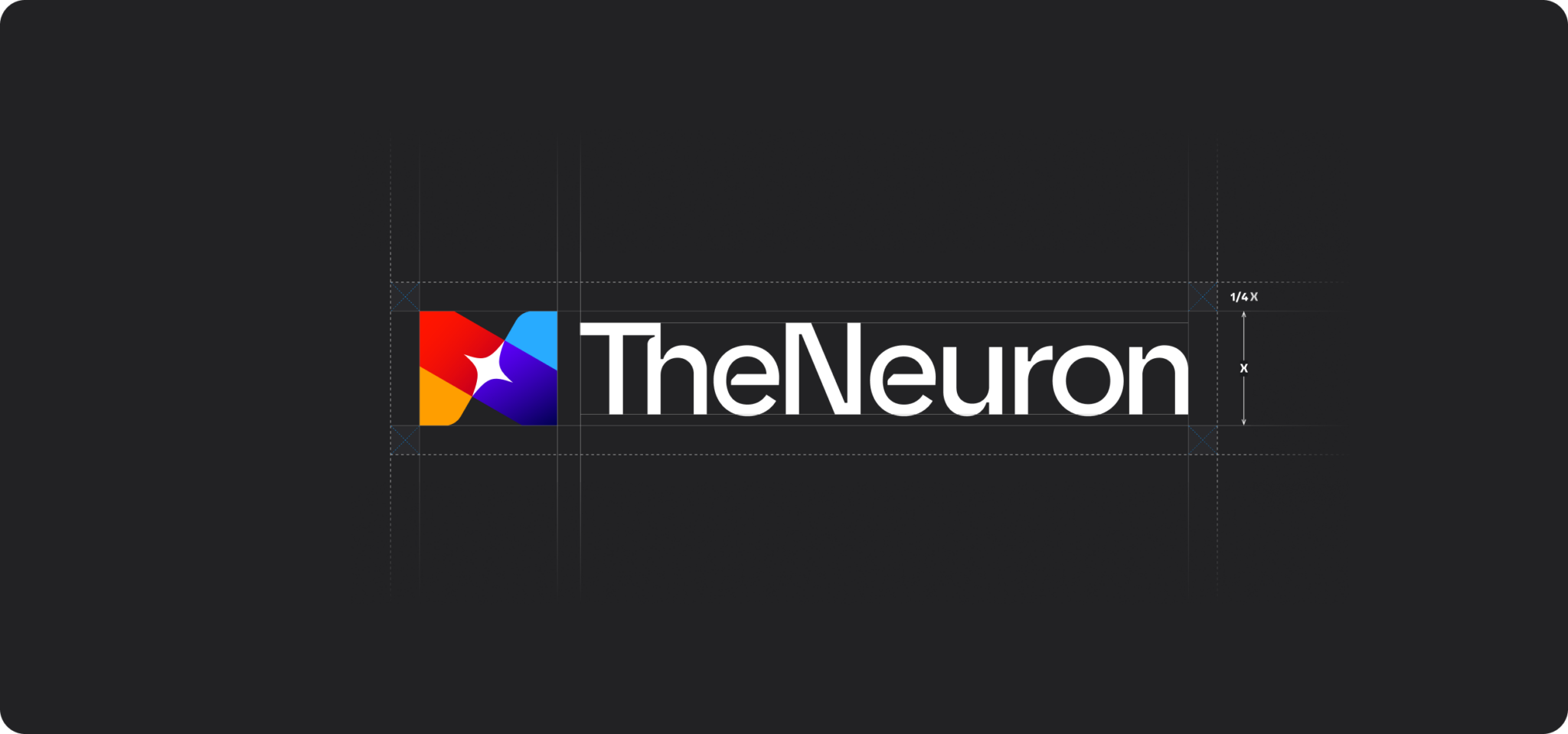
The Identity System
The new identity reads as a software brand first and a media brand second. The mark is built around a multicolor diamond that signals both data points and screens, the two things The Neuron actually moves.
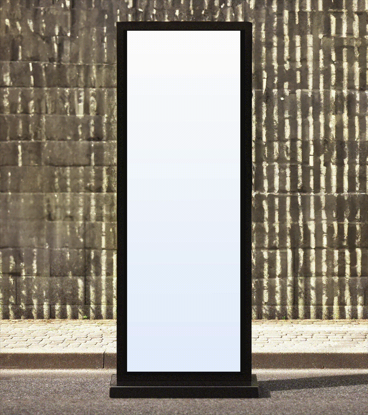
The visual system uses live mapping and real inventory views as the brand's hero asset. The product became the marketing. Audience zones, screen locations, weekly audience counts, and estimated audience reads are visualized inside the product UI itself, then carried across the brand surface so the marketing language and the product language stay aligned.
The supporting brand line "Smart Tools for Smarter Brand Growth" sits on the homepage to bridge the product story to the brand promise.
Applications
Site. Rebuilt on HubSpot with a product-led design. The hero is a live map view of inventory. The trust row sits below it with category-defining clients.
HubSpot automation. The full marketing stack is wired into the brand. Demo requests, free signups, qualified lead routing, and follow-up sequences all run inside the brand voice.
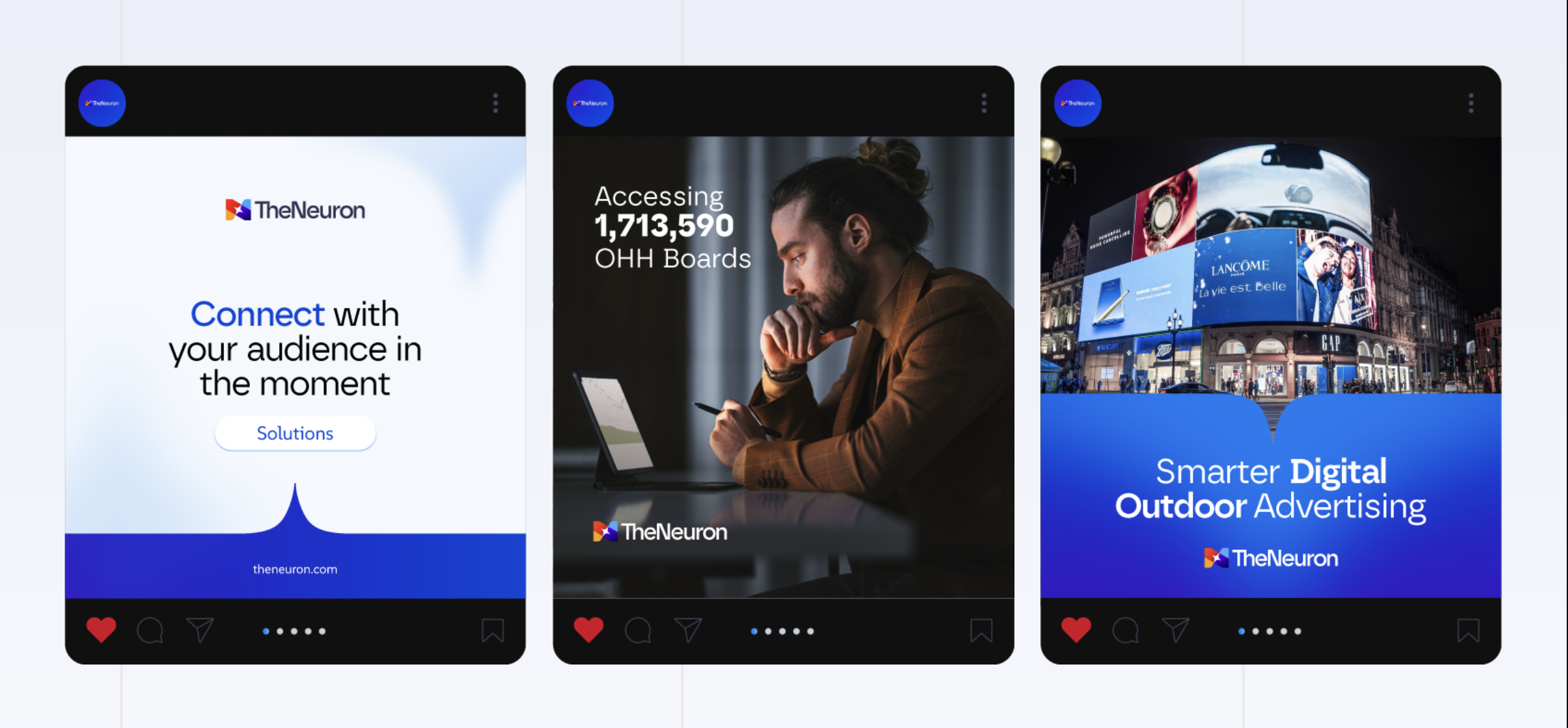
Cannes campaign. The Neuron showed up at Cannes Lions with a campaign designed to land in front of the global advertising community.
Inventory and product visualization. Maps, audience zones, and screen catalogs are designed as brand assets. The product UI and the marketing site share a visual language so a buyer who clicks Schedule a Demo doesn't experience a tonal break.
The Result
1,750% year over year web traffic growth. 4x quarterly increase in qualified leads. Standout brand presence at Cannes Lions.
The Neuron is now the brand the DOOH category turns to first when buyers want smarter, not just bigger.