The Challenge
In the quiet corners of Westport, the Westport Writers' Workshop hummed with creativity. The community was real. The teaching was real. The brand was boxed in. Stuck on Squarespace, with an identity that didn't match the energy inside the workshop. The organization was ready to grow, and the brand was the bottleneck.
The Strategy
We anchored the work to one principle. The brand should match the boldness of the work the writers actually do, not the politeness of the small-organization defaults the category lives in.
The Identity System
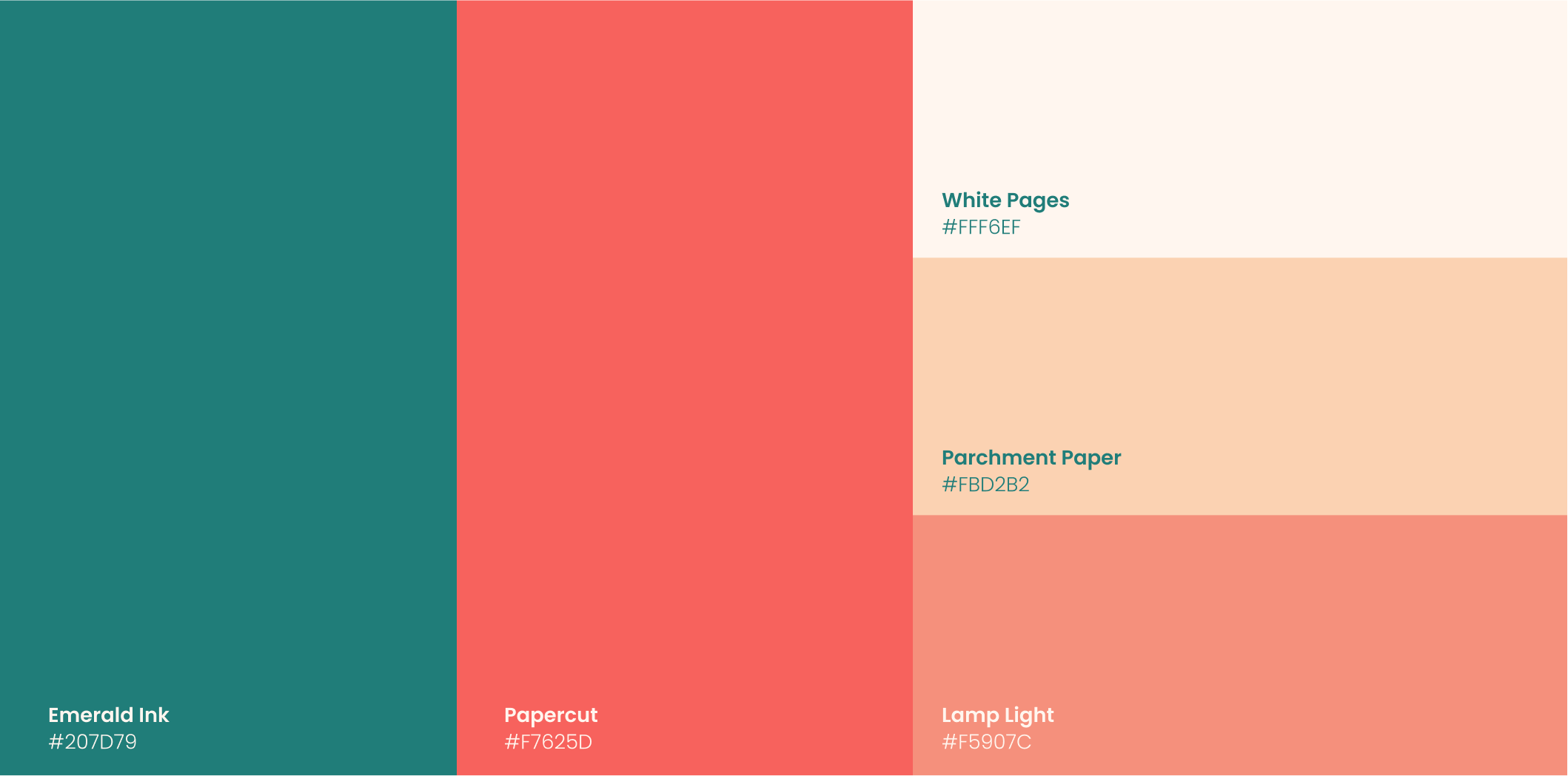
The visual identity is built around a bold, iconic typeface and a burst of bright color. The system turns heads inside a category that defaults to muted, refined, and quiet. The result reads as confident and contemporary while staying connected to the literary tradition Westport teaches.
The redesign moved beyond identity. We built scalable systems and migrated the organization to a robust platform that embraces automation, replacing the constrained Squarespace setup with infrastructure built to grow.
Applications
Visual identity. Bold typography, bright color, and the supporting system.
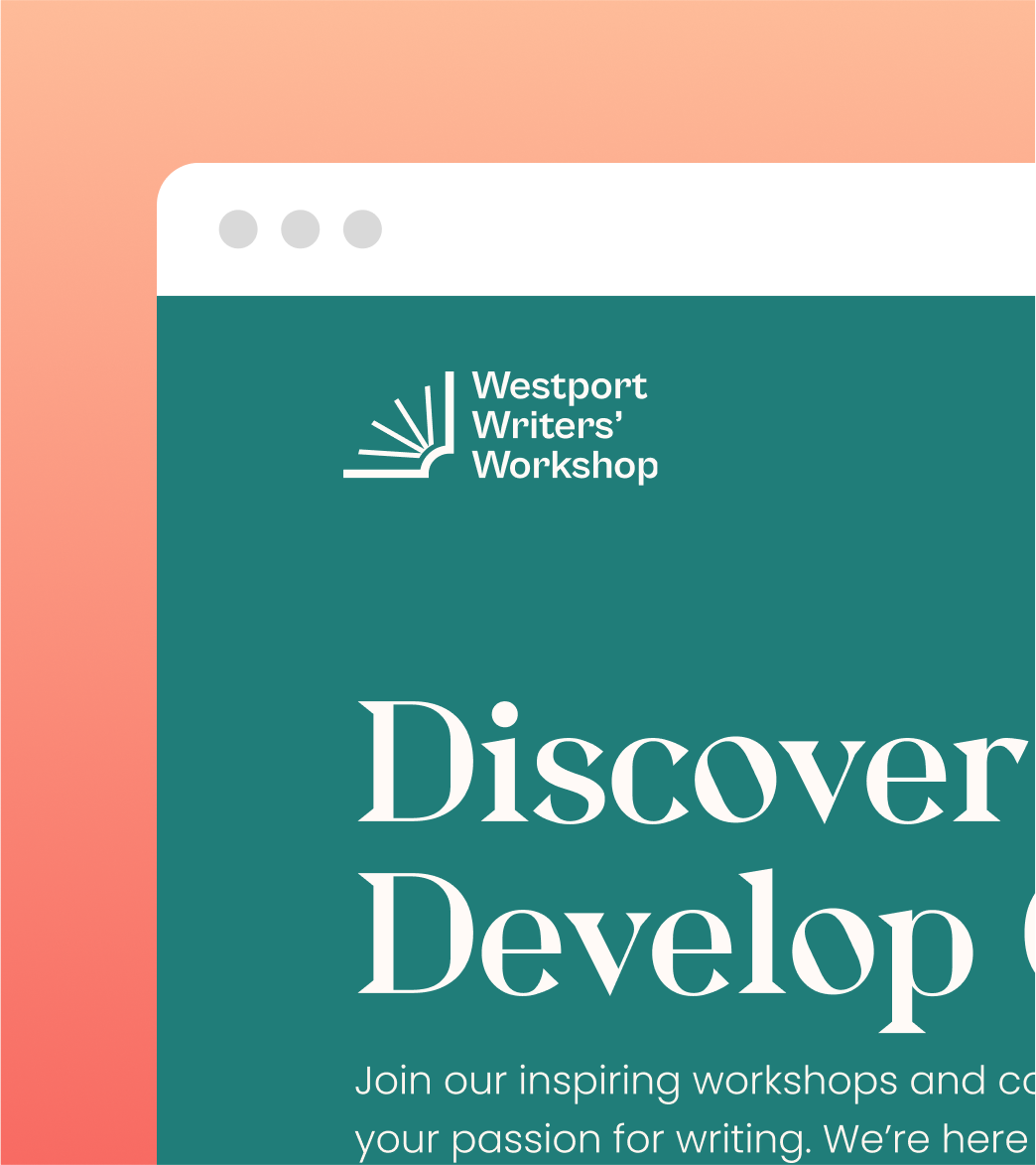
Web platform. Migration from Squarespace to a scalable platform with automation built in.
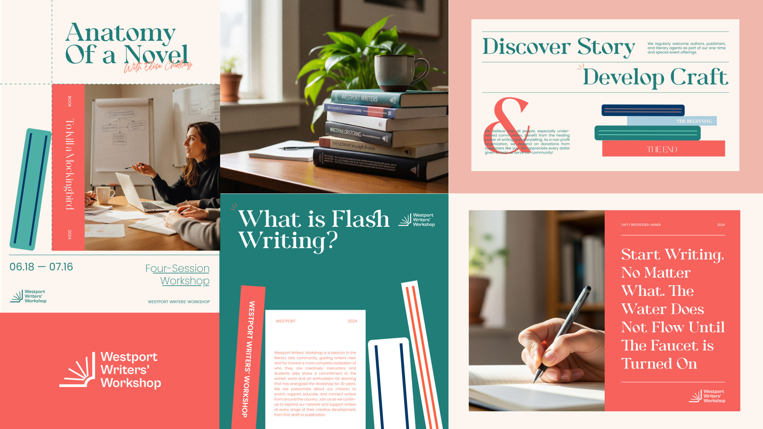
Community-facing materials. The touchpoints where Westport meets students and writers.