The Challenge
JLL is one of the most prominent global real estate services firms in the world. The company helps organizations buy, sell, finance, manage, and evolve property portfolios across commercial, residential, and mixed-use sectors. The work touches the largest property holders on earth, the institutions whose decisions shape skylines and labor markets and capital flows.
The brand had a posture problem. Commercial real estate as a category defaults to gravitas. Stone, glass, ledger, transaction. The category's brand language had matched the era of CRE that JLL was already moving past. JLL's actual advisory work, helping organizations imagine new built environments and shape long-term value, was bigger than the language the category gave it. The brand had to catch up to the firm's actual altitude.
The Strategy
In partnership with Havas, we anchored the rebrand to a single line.
The line does several jobs at once. It signals optimism, which positions JLL against a category that defaults to gravitas. It signals advisory, which is what JLL actually does for the world's largest property holders. And it signals direction, which is what a firm at JLL's scale earns the right to provide.
That positioning shift had to translate into every JLL service line, every market, and every conversation. From a global real estate investor sizing up a portfolio reposition to a single occupier evaluating a lease.
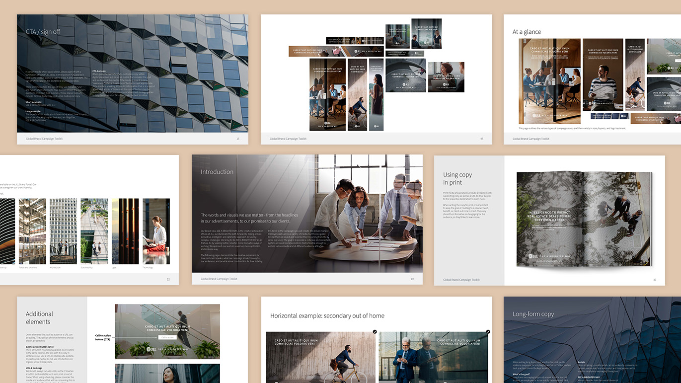
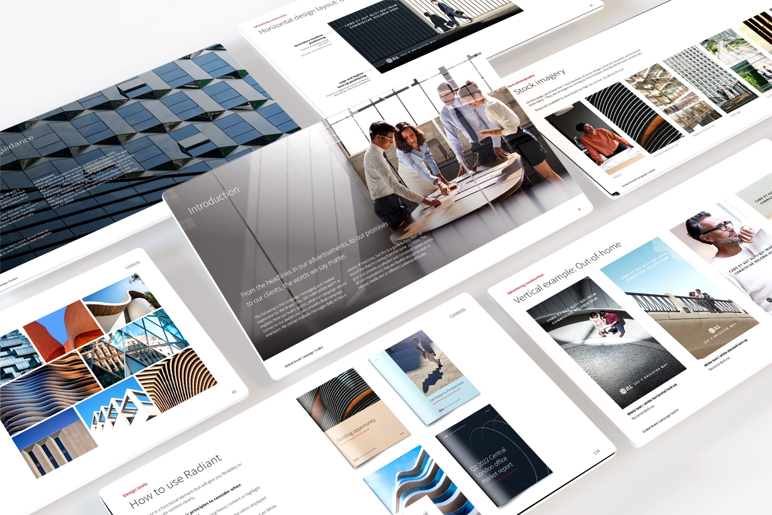
The Identity System
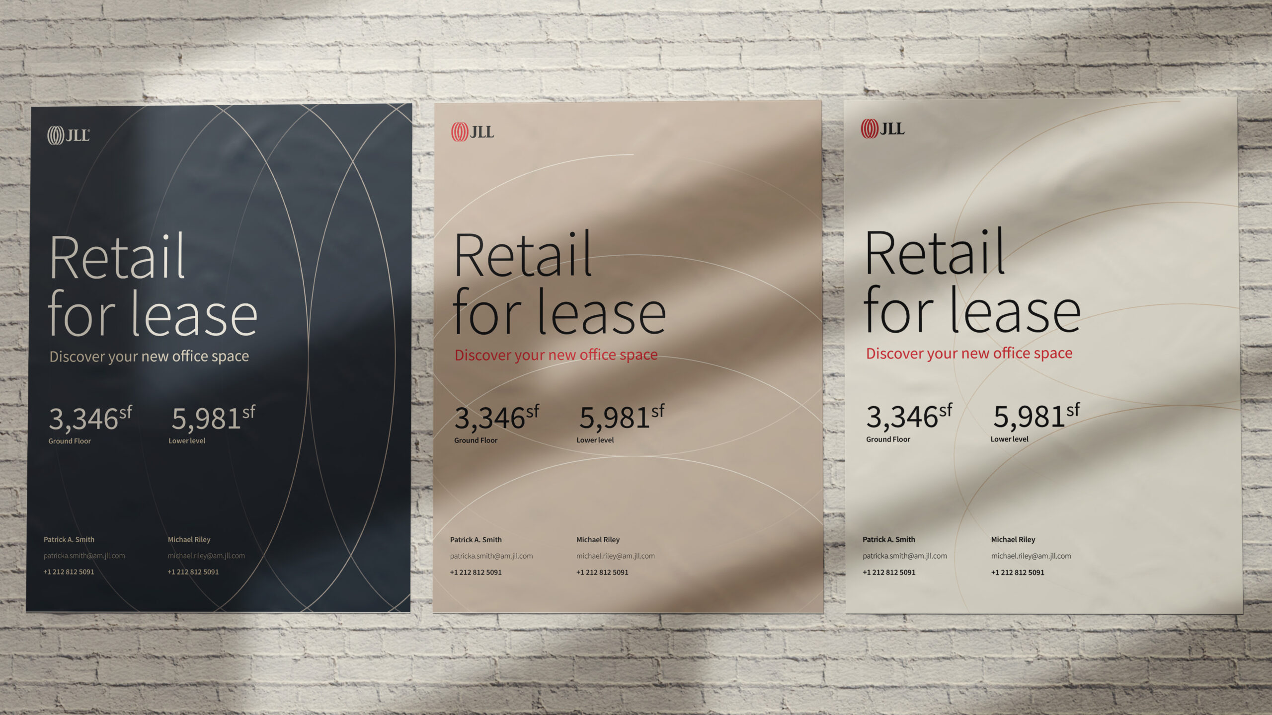
The visual system was rebuilt to match the optimism of the line. The expression leans into light, openness, and the spaces JLL helps shape, rather than the buildings JLL transacts on. Photography emphasizes people inside places, not facades. The system holds across the firm's global footprint while staying recognizably JLL in any market.
Typography supports both editorial and technical work. JLL produces market reports, investor presentations, and occupier strategy documents alongside the marketing surface. The type system carries every register without changing tone.
Applications
Brand campaign. "See a brighter way" rolled out across owned media, paid placement, and internal communications.
Service line architecture. The brand was built to hold JLL's breadth, including capital markets, leasing, property management, and consulting, without fragmenting into separate brand worlds.
Sub-brand integration. Orchard, JLL's sub-brand, was developed alongside the parent brand work.
Global rollout. The system was designed to work across JLL's regional markets while keeping the brand legible as one firm.